8 Automated EDA Tools That Reduce Plenty of Manual EDA Hard Work
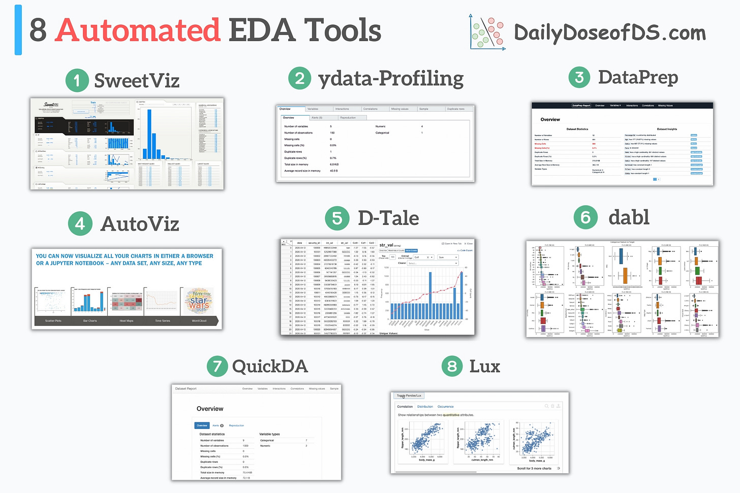
8 automated EDA tools in a single frame.
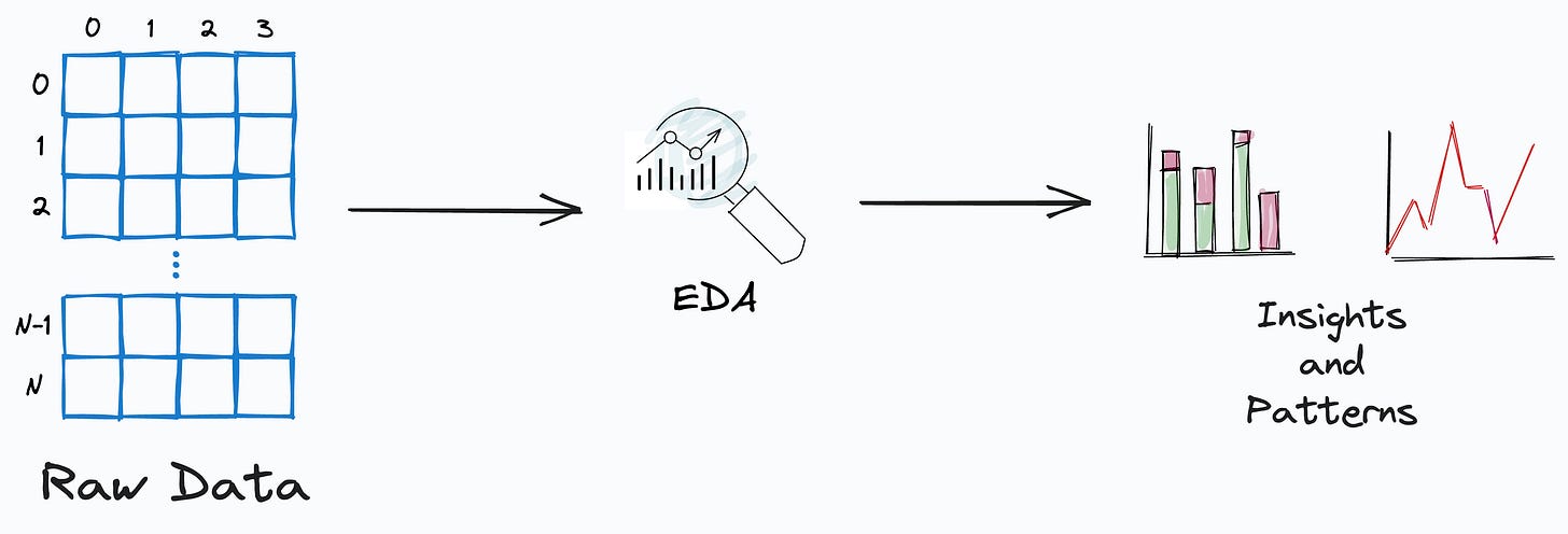
EDA is a vital step in all data science projects.
It is important because examining and understanding the data directly aids the modeling stage.
By uncovering hidden insights and patterns, one can make informed decisions about subsequent steps in the project.
Despite its importance, it is often a time-consuming and tedious task.
Below are 8 powerful EDA tools that automate many redundant EDA steps and help you profile your data quickly.
Before I begin:
Please note that these tools are not the ultimate EDA alternatives that will answer all your questions about the dataset.
But given that the preliminary EDA steps in almost all projects are the same — plotting the response variable, checking imbalance, running correlation analysis, missing value analysis, and more, these tools pretty well automate these steps in my opinion.
Also, at times, manual EDA can be prone to human errors and one may miss out on checking a few things.
Automated tools eliminate these risks and provide a standardized report across all projects.
SweetViz
Creates a variety of data visualizations.
Covers information about missing values, data statistics, etc.
Integrates with Jupyter Notebook.
Get started: GitHub.
ydata-profiling
Covers info about missing values, data statistics, correlation, etc.
Produces data alerts.
Plots data feature interactions.
Get started: GitHub.
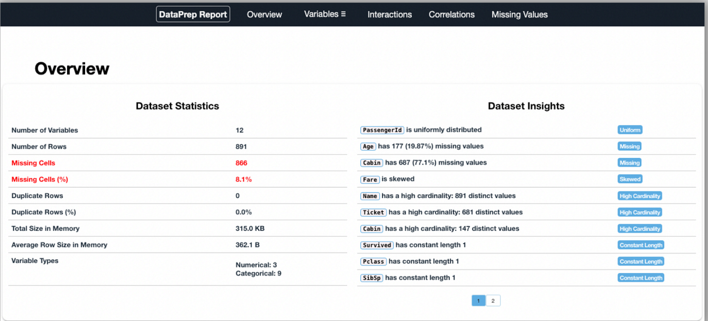
DataPrep
Produces interactive visualizations.
Typically faster than other common tools.
Supports Pandas and Dask DataFrames.
Covers info about missing values, data statistics, correlation, etc.
Plots data feature interactions.
Get started: GitHub.
AutoViz
Supports CSV, TXT, and JSON.
Interactive Bokeh charts.
Covers info about missing values, data statistics, correlation, etc.
Presents data cleaning suggestions.
Get started: GitHub.
D-Tale
Allows you to run many common Pandas operations with no code.
Exports code of analysis.
Integrates with Jupyter Notebook.
Covers info about missing values, data statistics, correlation, etc.
Highlights duplicates, outliers, etc.
Get started: GitHub.
dabl
Primarily provides visualizations.
Covers a wide range of plots:
Target distribution.
Scatter pair plots.
Histograms.
Get started: GitHub.
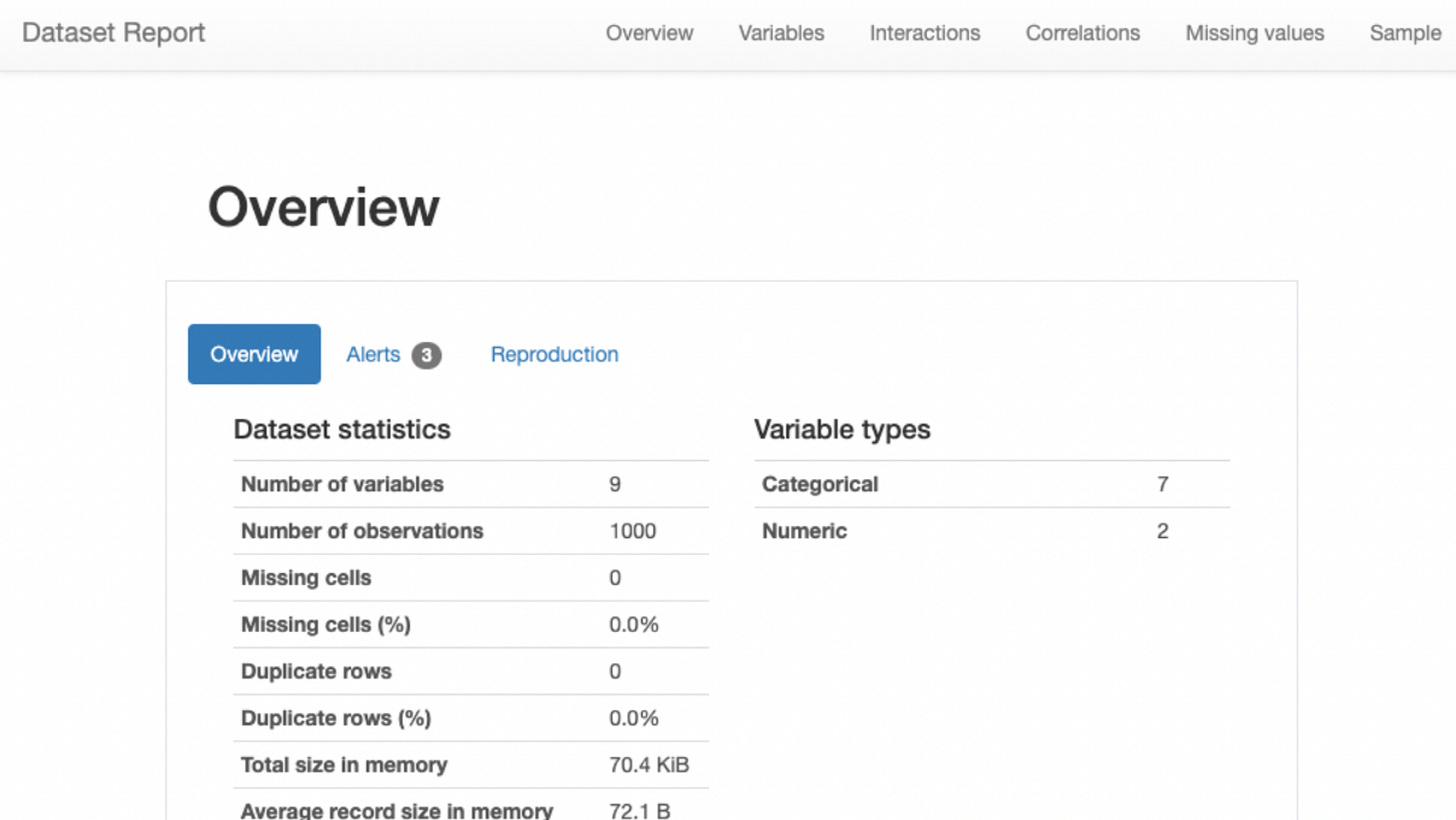
QuickDA
Get an overview report of the dataset.
Covers info about missing values, data statistics, correlation, etc.
Produces data alerts.
Plots data feature interactions.
Get started: GitHub.
Lux
Integrates with Jupyter Notebook.
Provides visualization recommendations.
Supports EDA on a subset of columns.
Get started: GitHub.
👉 Over to you: What are some other automated EDA tools that you are aware of?
👉 If you liked this post, don’t forget to leave a like ❤️. It helps more people discover this newsletter on Substack and tells me that you appreciate reading these daily insights.
The button is located towards the bottom of this email.
Thanks for reading!
Latest full articles
If you’re not a full subscriber, here’s what you missed last month:
DBSCAN++: The Faster and Scalable Alternative to DBSCAN Clustering
Federated Learning: A Critical Step Towards Privacy-Preserving Machine Learning
You Cannot Build Large Data Projects Until You Learn Data Version Control!
Sklearn Models are Not Deployment Friendly! Supercharge Them With Tensor Computations.
Deploy, Version Control, and Manage ML Models Right From Your Jupyter Notebook with Modelbit
Gaussian Mixture Models (GMMs): The Flexible Twin of KMeans.
To receive all full articles and support the Daily Dose of Data Science, consider subscribing:
👉 Tell the world what makes this newsletter special for you by leaving a review here :)
👉 If you love reading this newsletter, feel free to share it with friends!


