A Visual and Intuitive Guide to QQ Plot That You Always Wanted to Read
Drawing a QQ plot from scratch
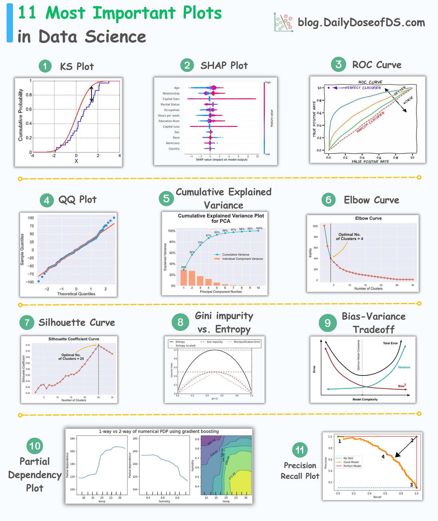
A few days back, I released a post on the 11 most important plots in data science.
Here’s the visual for a quick recap:
After releasing this post, a few of you showed interest in intuitively understanding how a QQ plot is created.
This is a pretty good topic to cover, as I have seen many struggling to intuitively make sense of a QQ plot.
So let’s discuss it today.
For starters:
A QQ plot allows us to visually assess the similarity between two distributions.
It does this by plotting the quantiles of the two distributions against each other.
The deviations from the straight line indicate the differences between the two distributions.
Here’s how it is created.
Consider we have two distributions, D1 and D2.
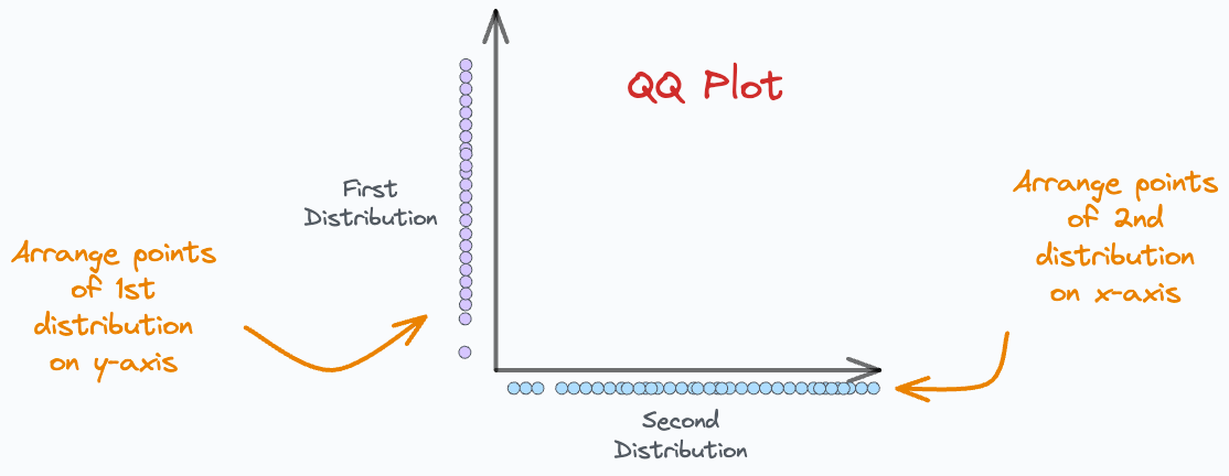
Step 1) Arrange points on axes:
As shown below, we arrange points of D1 on the y-axis and D2 on the x-axis.
Step 2) Draw percentile lines
Next, for both distributions, we create some percentile lines.
For instance, on both axes, we can mark the points of 10th percentile, 20th percentile, 30th percentile, etc., from both distributions.
This is shown below:
We mark the percentile locations for both distributions and intersect the corresponding lines.
10th percentile of D1 is intersected with 10th percentile of D2.
20th percentile of D1 is intersected with 20th percentile of D2.
and so on.
The intersection points of these percentile lines gives us the points we typically see in a QQ plot:
Now, we can get rid of the percentile marker lines.
In a gist, the above plot gives us the location where the corresponding percentiles of the two distributions match.
Step 3) Add the reference line
Finally, we must add a reference line to determine the deviations between the two distributions.
There are many ways to do this.
For instance:
The line connecting the 25th and 75th percentiles of both distributions can be considered as a reference line.
The regression fit on the above scatter plot can be considered as a reference line.
After adding the reference line, we get our QQ plot:
The deviations from this reference line indicate that the two distributions differ from each other.
In other words, the deviations mean that the corresponding percentiles do not align.
This becomes an indicator of distributional dissimilarities.
And, of course, the more percentiles we plot, the better and more useful will be the QQ plot.
There are many applications of the QQ plot.
For instance, say we have an observed distribution, and we want to determine if it resembles a normal distribution.
We can use a QQ plot for this:
D1: The observed distribution
D2: Normal distribution.
If the percentile points lie closer to the reference line, this would mean that the observed distribution is more like a normal distribution. This is depicted below:
👉 Over to you: What other plots do you typically struggle with and want me to cover?
👉 If you liked this post, don’t forget to leave a like ❤️. It helps more people discover this newsletter on Substack and tells me that you appreciate reading these daily insights.
The button is located towards the bottom of this email.
Thanks for reading!
Latest full articles
If you’re not a full subscriber, here’s what you missed last month:
You Cannot Build Large Data Projects Until You Learn Data Version Control!
Why Bagging is So Ridiculously Effective At Variance Reduction?
Sklearn Models are Not Deployment Friendly! Supercharge Them With Tensor Computations.
Deploy, Version Control, and Manage ML Models Right From Your Jupyter Notebook with Modelbit
Model Compression: A Critical Step Towards Efficient Machine Learning.
Gaussian Mixture Models (GMMs): The Flexible Twin of KMeans.
To receive all full articles and support the Daily Dose of Data Science, consider subscribing:
👉 Tell the world what makes this newsletter special for you by leaving a review here :)
👉 If you love reading this newsletter, feel free to share it with friends!


Always an informative read!
Great as always!