A Visualisation Guide on Sankey Diagrams
A pretty useful plot which simplifies visualizing flow data.
Many tabular data analysis tasks can be interpreted as a flow between several source and target entities.
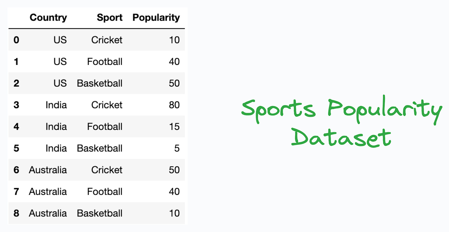
For instance, consider we have a sports popularity dataset, which lists the popularity index of a sport in a country, as shown below:
In this dataset:
Countries are entities.
Sports are entities.
Information flowing between them is the popularity value.
While typical plots, like grouped bar plots, could be used here to understand the popularity distribution of country-wise sports, as shown below:
…in my opinion, however, Sankey diagrams stand out as a pretty cool and elegant alternative to represent such flow datasets:
Their links are represented with arcs whose width is proportional to the value of the flow. This immensely simplifies the data analysis process.
For instance, from the Sankey diagram above, one can quickly infer that:
The most popular sport in India is Cricket.
Basketball and Football are almost equally popular in the US.
Basketball is hardly popular in India and England.
England’s most popular sport is Football.
Cricket and Football are almost equally popular in Australia.
Overall, Football is the most popular sport in this dataset.
and many many more.
Imagine doing that by looking at the tabular data or a grouped bar chart shown below:
This process will be time-consuming.
You may miss out on a few insights.
The grouped bar chart can appear pretty cluttered and messy at times.
Of course, Sankey diagrams can have multiple levels as well, as shown below:
To determine when to use Sankey diagrams, see if the data involves any kind of flow of resources, energy, or information flow between multiple stages or entities.
If yes, Sankey diagrams could be pretty valuable.
There are multiple ways to create Sankey diagrams:
To generate them programmatically, you may use the
ipysankeywidgetlibrary: GitHub.If you prefer GUI, SankeyMATIC is a pretty cool, and easy-to-use tool to create Sankey diagrams which I often use: SankeyMATIC.
Aren’t these Sankey plots quite an elegant plotting alternative to traditional plots that you may have used otherwise?
👉 Over to you: What are some other gems of data visualization that deserve more attention?
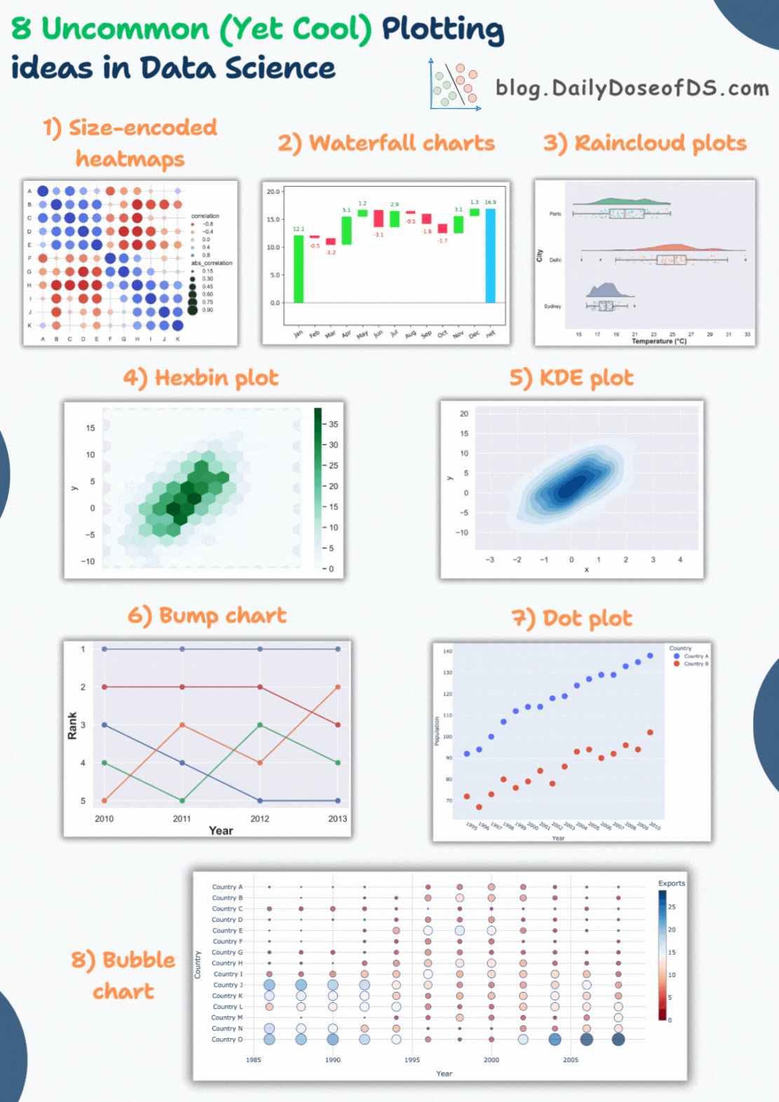
I covered some of them in the following issue, and they are depicted in the visual below: 8 Elegant Alternatives to Traditional Plots.
Are you overwhelmed with the amount of information in ML/DS?
Every week, I publish no-fluff deep dives on topics that truly matter to your skills for ML/DS roles.
For instance:
Conformal Predictions: Build Confidence in Your ML Model’s Predictions
Quantization: Optimize ML Models to Run Them on Tiny Hardware
5 Must-Know Ways to Test ML Models in Production (Implementation Included)
8 Fatal (Yet Non-obvious) Pitfalls and Cautionary Measures in Data Science
Implementing Parallelized CUDA Programs From Scratch Using CUDA Programming
You Are Probably Building Inconsistent Classification Models Without Even Realizing
And many many more.
Join below to unlock all full articles:
SPONSOR US
Get your product in front of 85,000 data scientists and other tech professionals.
Our newsletter puts your products and services directly in front of an audience that matters — thousands of leaders, senior data scientists, machine learning engineers, data analysts, etc., who have influence over significant tech decisions and big purchases.
To ensure your product reaches this influential audience, reserve your space here or reply to this email to ensure your product reaches this influential audience.


