
Analyse Flow Data With Sankey Diagrams

Many tabular data analysis tasks can be interpreted as a flow between the source and a target.
Here, manually analyzing tabular reports/data to draw insights is typically not the right approach.
Instead, Flow diagrams serve as a great alternative in such cases.
Being visually appealing, they immensely assist you in drawing crucial insights from your data, which you may find challenging to infer by looking at the data manually.
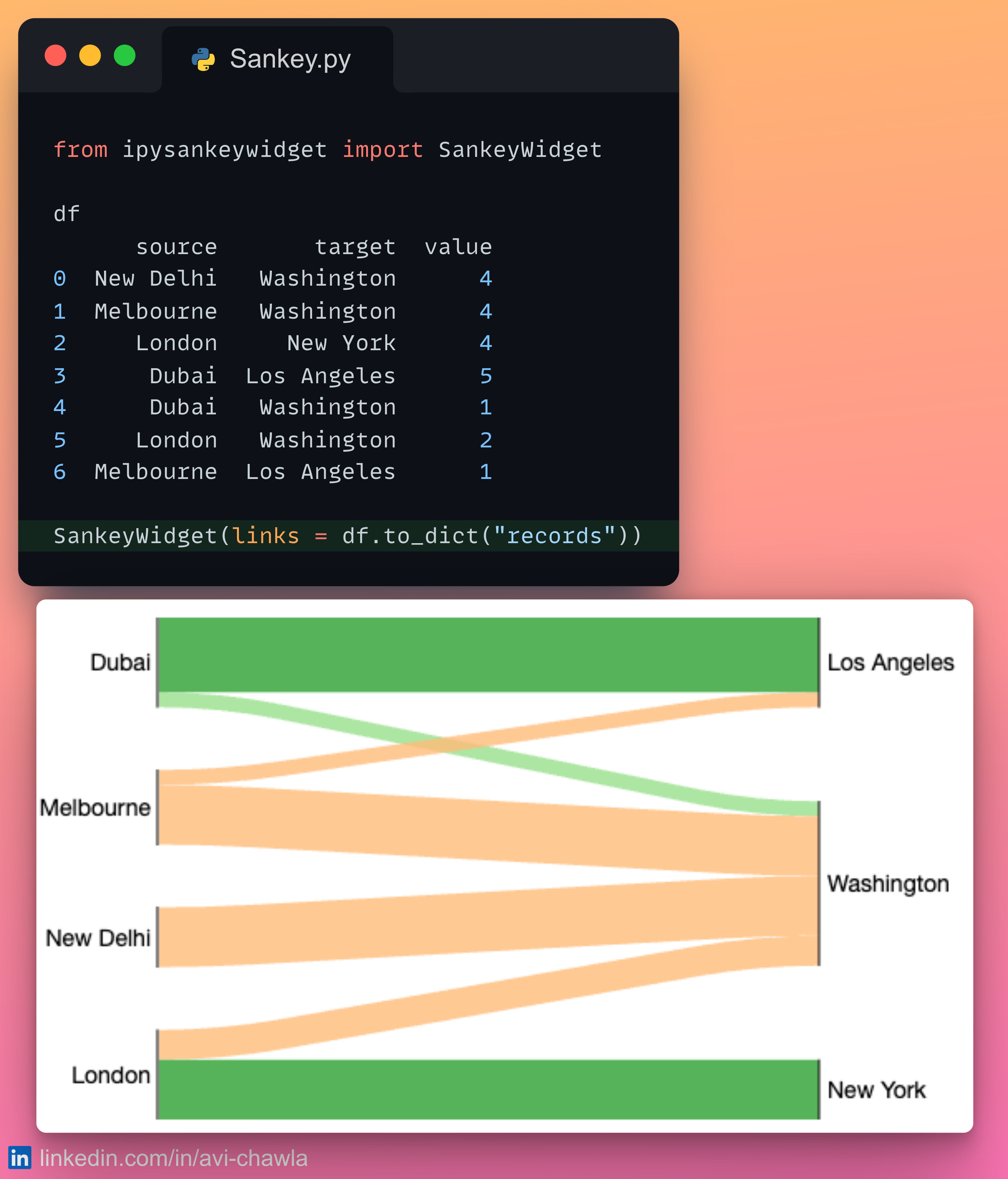
For instance, from the diagram above, one can quickly infer that:
1. Washington hosts flights from all origins.
2. New York only receives passengers from London.
3. Majority of flights in Los Angeles come from Dubai.
4. All flights from New Delhi go to Washington.
Now imagine doing that by just looking at the tabular data. Not only will it be time-consuming, but there are chances that you may miss out on a few insights.
To generate a flow diagram, you can use floWeaver. It helps you to visualize flow data using Sankey diagrams.
Read more here: Documentation.
I like to explore, experiment and write about data science concepts and tools. You could connect with me on LinkedIn.