Avoid Using PCA for Visualization Unless
...this plot says so.
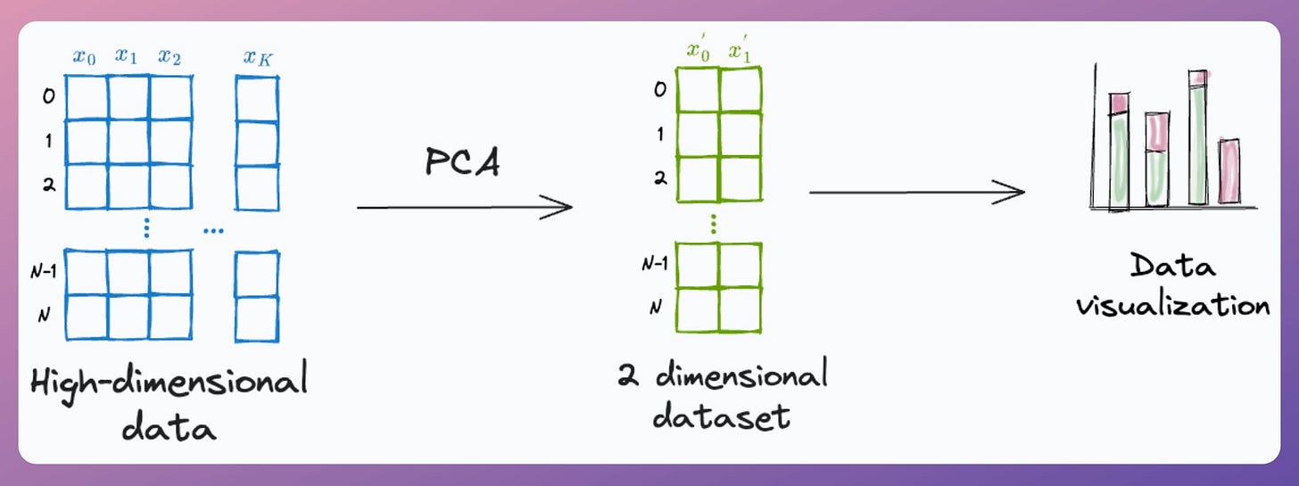
PCA, by its very nature, is a dimensionality reduction technique.
Yet, at times, it is used to visualize high-dimensional datasets by projecting the data into two dimensions.
Here's the problem with it.
After applying PCA, each new feature (PC1, PC2, ..., PC-N) captures a fraction of the original data variance:
PC1 may capture 40%.
PC2 may capture 25%.
And so on.
Thus, using PCA for visualization by projecting the data to 2-dimensions only makes sense if the first two principal components collectively capture most of the original data variance.
This is rarely true in practice.
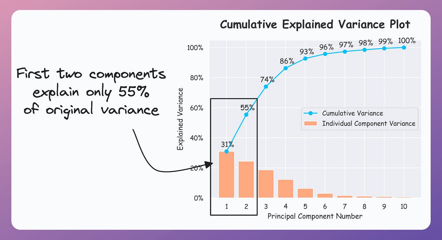
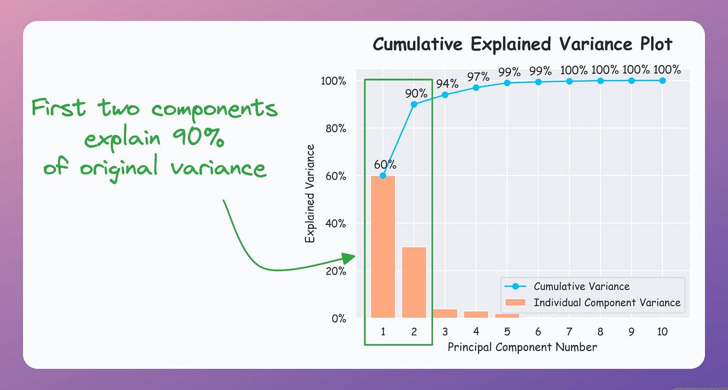
But it is possible to verify if PCA's visualization is useful by creating a cumulative explained variance (CEV) plot.
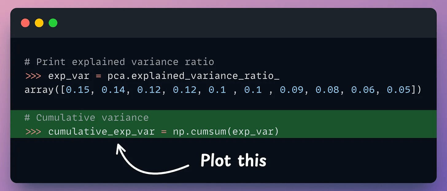
It plots the cumulative variance explained by principal components.
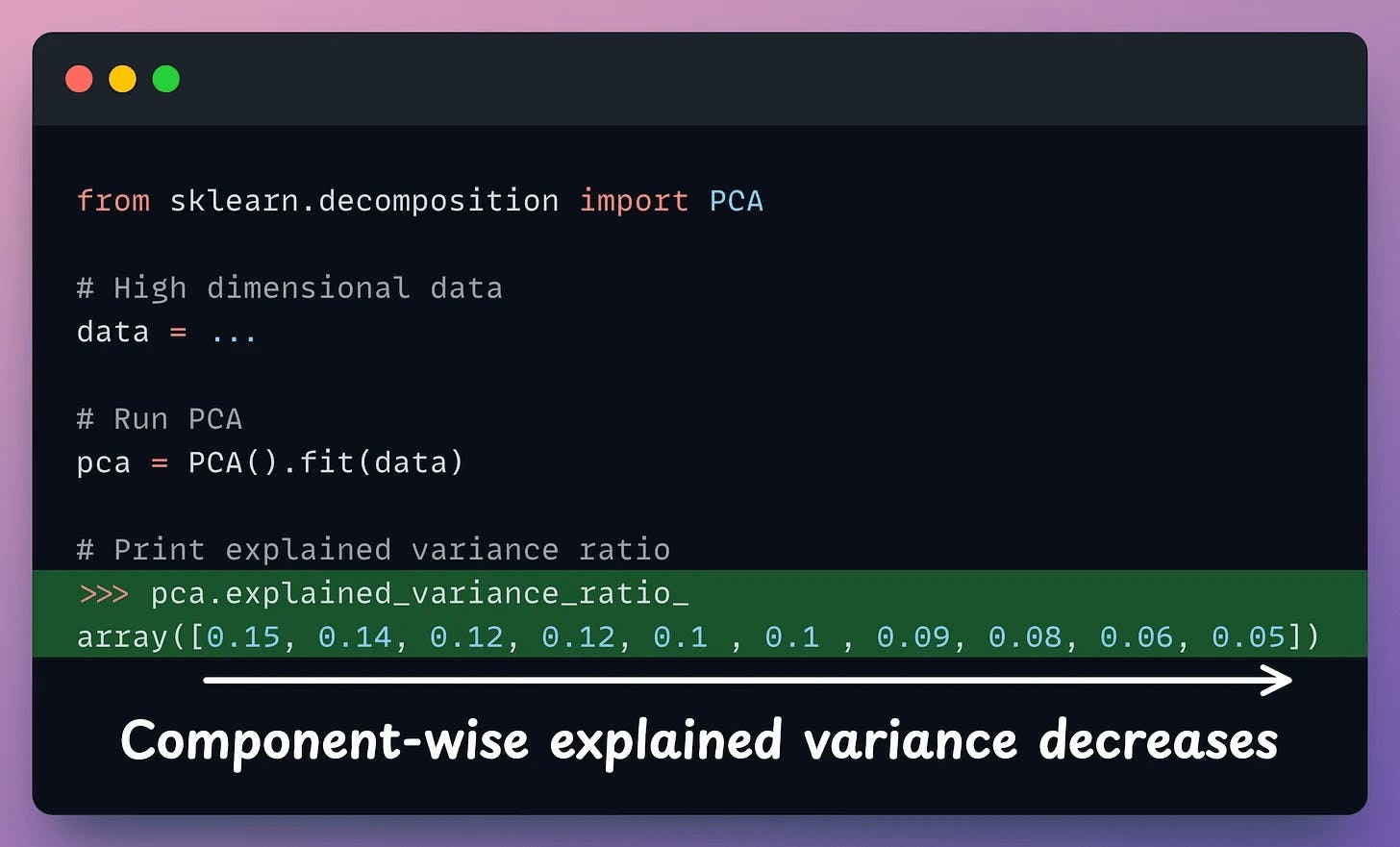
In sklearn, the explained variance fraction is available in the explained_variance_ratio_ attribute:
Create a cumulative plot of explained variance and check whether the first two components explain the majority of variance.
If the plot looks the following, your PCA visualizations are misleading since the first two components only explain 55% of the variance:
But if the plot looks like the following, it is safe to use PCA:
As a takeaway, use PCA for 2D visualization only when the above plot suggests so.
That said, use the CEV plot only for dimensionality reduction to determine how many dimensions to project the data to when using PCA.
For instance, in the following plot, projecting to 5 dimensions could be good (depending on how much information loss you can tolerate):
For visualization, however, use techniques specifically designed for it, like t-SNE, UMAP, etc.
We formulated and implemented (in NumPy) t-SNE from scratch here.
We discussed the mathematical details of PCA and derived it from scratch here.
👉 Over to you: What are some other problems with using PCA for visualization?
P.S. For those wanting to develop “Industry ML” expertise:
At the end of the day, all businesses care about impact. That’s it!
Can you reduce costs?
Drive revenue?
Can you scale ML models?
Predict trends before they happen?
We have discussed several other topics (with implementations) in the past that align with such topics.
Here are some of them:
Learn sophisticated graph architectures and how to train them on graph data: A Crash Course on Graph Neural Networks – Part 1.
So many real-world NLP systems rely on pairwise context scoring. Learn scalable approaches here: Bi-encoders and Cross-encoders for Sentence Pair Similarity Scoring – Part 1.
Learn techniques to run large models on small devices: Quantization: Optimize ML Models to Run Them on Tiny Hardware.
Learn how to generate prediction intervals or sets with strong statistical guarantees for increasing trust: Conformal Predictions: Build Confidence in Your ML Model’s Predictions.
Learn how to identify causal relationships and answer business questions: A Crash Course on Causality – Part 1
Learn how to scale ML model training: A Practical Guide to Scaling ML Model Training.
Learn techniques to reliably roll out new models in production: 5 Must-Know Ways to Test ML Models in Production (Implementation Included)
Learn how to build privacy-first ML systems: Federated Learning: A Critical Step Towards Privacy-Preserving Machine Learning.
Learn how to compress ML models and reduce costs: Model Compression: A Critical Step Towards Efficient Machine Learning.
All these resources will help you cultivate key skills that businesses and companies care about the most.
SPONSOR US
Get your product in front of 450k+ data scientists and other tech professionals.
Our newsletter puts your products and services directly in front of an audience that matters — thousands of leaders, senior data scientists, machine learning engineers, data analysts, etc., who have influence over significant tech decisions and big purchases.
To ensure your product reaches this influential audience, reserve your space here or reply to this email to ensure your product reaches this influential audience.


