Bubble Charts: A Non-Messy Alternative to Bar Plot
A step towards simplifying common data visualizations.
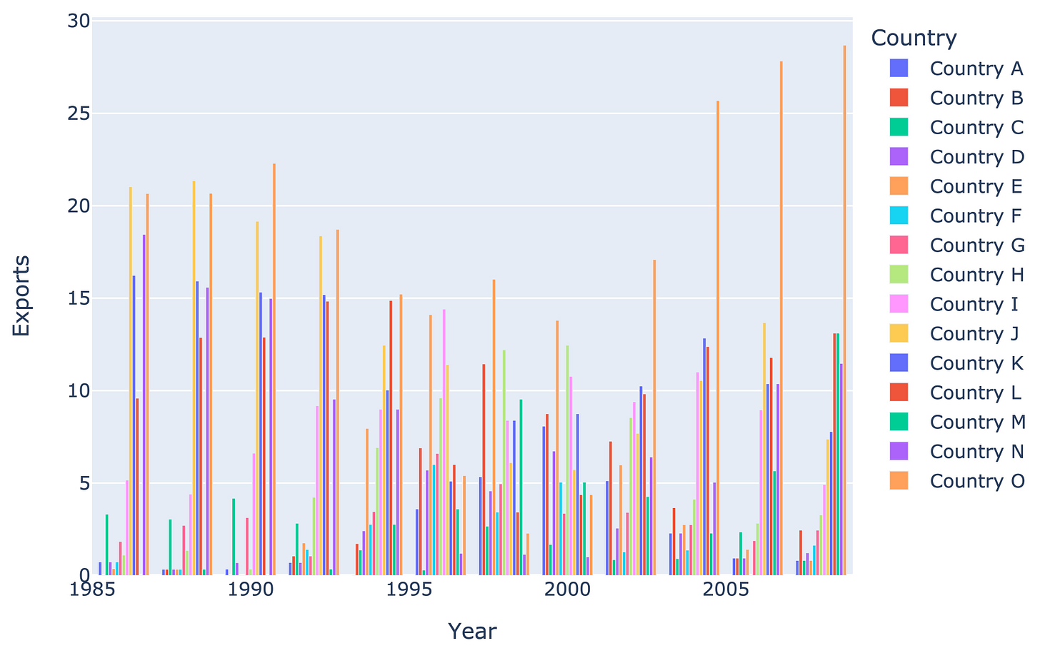
Bar plots quickly get messy and cluttered as the number of categories increases.
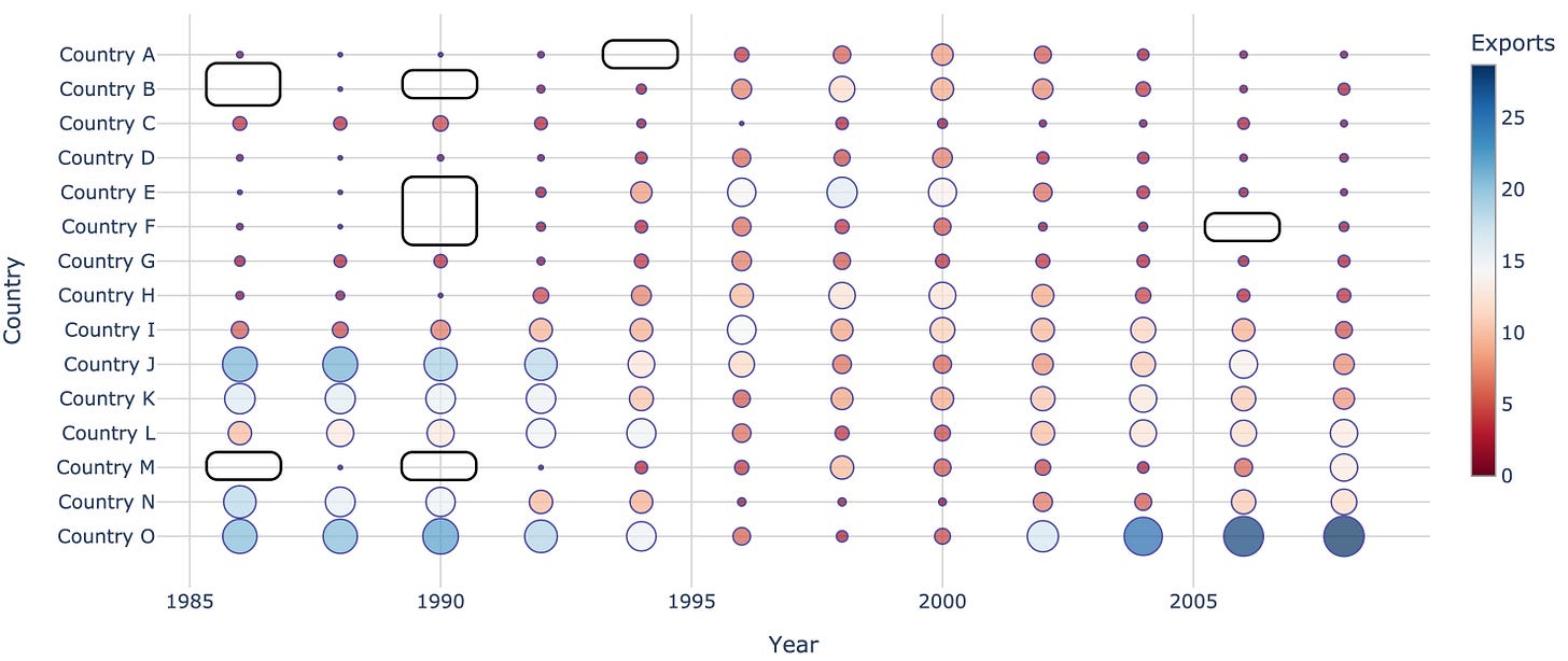
A bubble plot is often a better alternative in such cases.
They are like scatter plots but:
with one categorical axis
and one continuous axis
Compared to a bar plot, they are less cluttered and offer much better comprehension.
This is also evident from the image above.
It is difficult to interpret the bar plot because it has too many bars packed into a small space:
For instance, by looking at the bar plot above, it is almost impossible to tell which countries did no exports and in which year.
But now look at the bubble chart:
The size-encoded bubbles make it totally effortless to find countries and their year of no exports.
I created the above chart using Plotly: Notebook.
Isn’t that cool?
👉 Over to you: What are some other better alternatives to bar plots and when to use them?
👉 If you liked this post, don’t forget to leave a like ❤️. It helps more people discover this newsletter on Substack and tells me that you appreciate reading these daily insights. The button is located towards the bottom of this email.
Thanks for reading :)
Whenever you’re ready, here are a couple of more ways I can help you:
Get the full experience of the Daily Dose of Data Science. Every week, receive two curiosity-driven deep dives that:
Make you fundamentally strong at data science and statistics.
Help you approach data science problems with intuition.
Teach you concepts that are highly overlooked or misinterpreted.
Promote to 30,000 subscribers by sponsoring this newsletter.
👉 Tell the world what makes this newsletter special for you by leaving a review here :)
👉 If you love reading this newsletter, feel free to share it with friends!


I completely agree that the bar chart is completely useless method of presenting more than very few series. However for data like your example, I prefer an actual table with the background of each cell colored using the same kind of color scale you did in the bubble chart. The background colors effectively turn the table into a heatmap which very quickly can give an overview of the “shape” of the data. Then the literal numbers offer higher accuracy for drilling in. In comparison to the bubble example the color filling the whole cell rather than just inside the bubble makes it easier to see the overall pattern (like a low resolution picture with large pixels), without being broken up by the repeating circles and large amount of unused white space in the bubble chart. The bubble size only gives an approximate impression of magnitude of the value, but this isn’t that helpful as color scale already does that and does it better as you can show things like negative values with contrasting colors that can’t be mapped to circle size, and while human visual systems is adept at picking our shapes in a color field, it’s not really adapted to surveying a large number of different objects of different sizes and picking out patterns from that.
That great!
Was struggle to make in order Xaxes with bar and scatter made my day!
Thx, Bro!