Don't Overuse Scatter, Line and Bar Plots. Try These Four Elegant Alternatives.
Better alternatives to scatter, bar, and line plots.
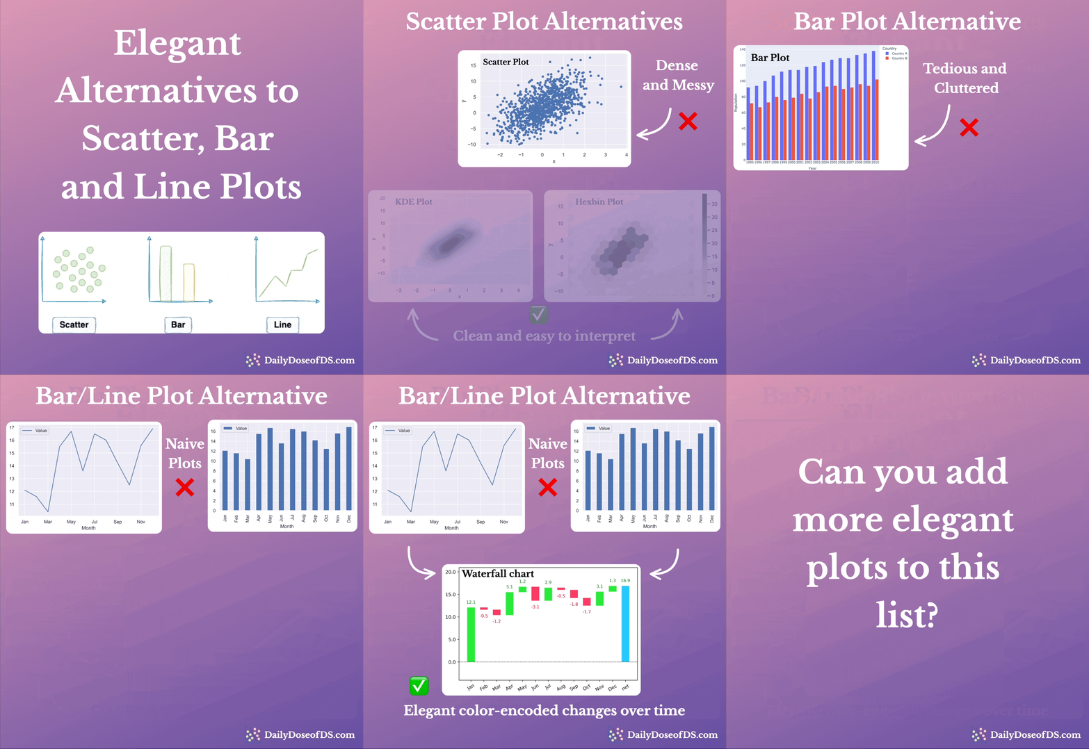
Scatter, bar, and line plots are the three most commonly used plots to visualize data.
While these plots do cover a wide variety of visualization use cases, many data scientists use them excessively in every possible place.
Here are some alternatives that can supercharge your visualizations.
Scatter plot alternatives
When you have thousands of data points, scatter plots can get too dense to interpret.
Instead, you can replace them with Hexbin or KDE plots.
Hexbin plots bin the area of a chart into hexagonal regions. Each region is assigned a color intensity based on the method of aggregation used (the number of points, for instance).
A KDE plot illustrates the distribution of a set of points in a two-dimensional space.
A contour is created by connecting points of equal density. In other words, a single contour line depicts an equal density of data points.
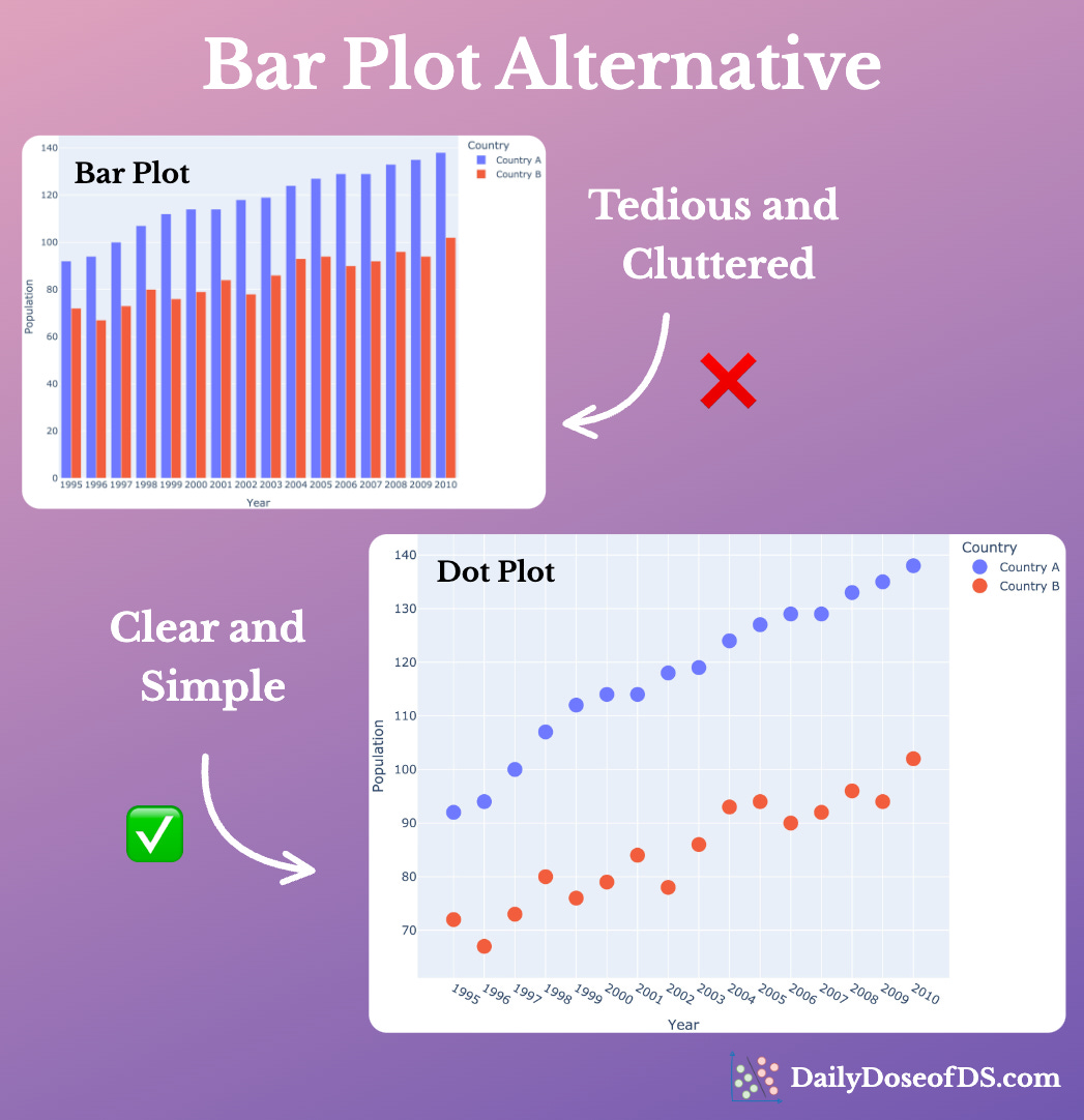
Bar plot alternative
When you have many categories to depict, the plot can easily get cluttered and messy.
Instead, you can replace them with Dot plots. They are like scatter plots but with one categorical and one continuous axis.
Line/Bar plot alternative
When visualizing the change in value over time, it is difficult to depict incremental changes with a bar/line plot.
Instead, try Waterfall charts. The changes are automatically color-coded, making them easier to interpret.
👉 Over to you: What are some other elegant alternatives to commonly used plots?
I have written a Medium article on this if you are interested in learning more: Medium Blog.
👉 Read what others are saying about this post on LinkedIn and Twitter.
👉 Tell the world what makes this newsletter special for you by leaving a review here :)
👉 If you liked this post, don’t forget to leave a like ❤️. It helps more people discover this newsletter on Substack and tells me that you appreciate reading these daily insights. The button is located towards the bottom of this email.
👉 If you love reading this newsletter, feel free to share it with friends!
Find the code for my tips here: GitHub.
I like to explore, experiment and write about data science concepts and tools. You can read my articles on Medium. Also, you can connect with me on LinkedIn and Twitter.


I like to plot an ECDF instead of a histogram, as long as you know how to interpret it.