Enrich Your Confusion Matrix With A Sankey Diagram
An unexplored direction of visualising a confusion matrix.
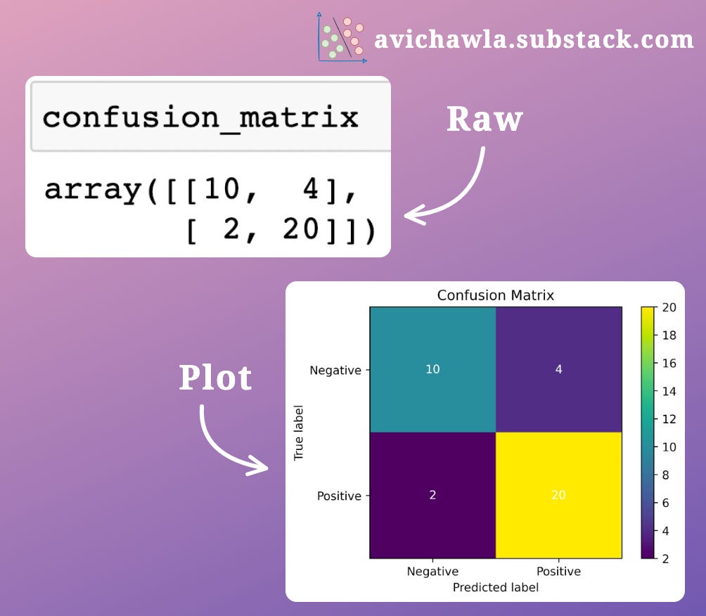
A confusion matrix is mostly interpreted as is, i.e., raw numbers. Sometimes though, it is also visualized by plotting it.
Yet, both these ways are not interactive and truly elegant.
Plotting a confusion matrix as a Sankey diagram is an option worth exploring here.
If you wish to read more about Sankey Diagrams, read my previous post here: Analyse Flow Data With Sankey Diagrams.
As demonstrated below, one can interactively interpret the number of instances belonging to each class and how they were classified.
What's more, hovering over the links gives more info about those instances, which can offer better interpretability.
What do you think? Is this a better approach than the traditional ones? Let me know :)
Find the code for creating the above Confusion Matrix Sankey diagram here: Notebook.
👉 Read what others are saying about this post on LinkedIn and Twitter.
👉 If you liked this post, don’t forget to leave a like ❤️. It helps more people discover this newsletter on Substack and tells me that you appreciate reading these daily insights. The button is located towards the bottom of this email.
👉 If you love reading this newsletter, feel free to share it with friends!
Find the code for my tips here: GitHub.
I like to explore, experiment and write about data science concepts and tools. You can read my articles on Medium. Also, you can connect with me on LinkedIn and Twitter.


