How to Create a Calendar Plot in Python?
A richer alternative to line plot.
Calendar maps are a pretty cool way to depict the day-by-day variation in a dataset over a longer period, usually a year.
You must have seen them on GitHub:
I always wondered how one can create them in Python.
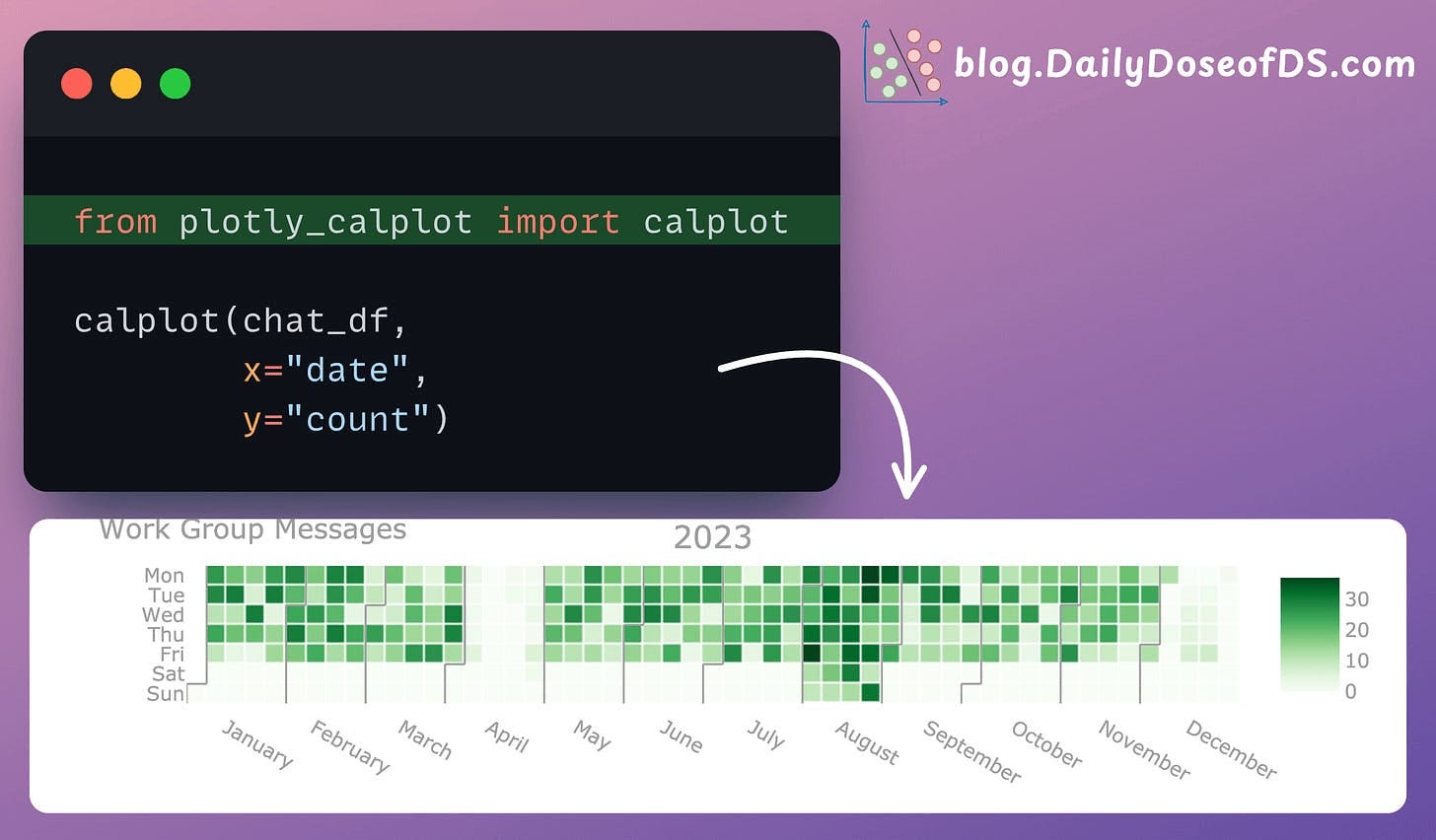
Turns out, there’s a pretty simple way to do it just two lines of Python using Plotly Calplot.
To create a calendar map, we can use the calplot() method from this library.
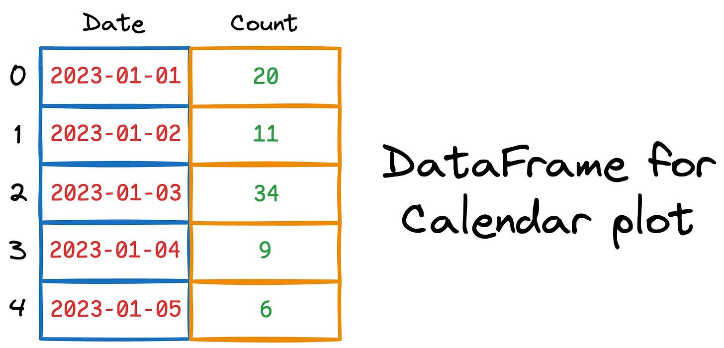
The input should be a Pandas DataFrame. Each row should represent a date and a corresponding value we wish to depict in the calendar plot, as depicted below:
Done!
Next, we can create a calendar plot as follows:
It’s pretty clear that this plot reveals many insights that otherwise would have been difficult to extract with traditional plots or aggregation methods.
This team took a one-month break in April and December. Or, if they are a remote team, they may have met in person during these two months.
They were pretty consistent on a 5-day work policy.
August is when they worked the most.
One of the best use cases of calendar plots is to understand weekly/monthly seasonality in data.
Here's an earlier issue on 8 Classic Alternatives to Traditional Plots →
I will give many ideas on replacing traditional plots with better plots and under which situations.
👉 Over to you: What other usages of calendar plots have I missed?
P.S. For those wanting to develop “Industry ML” expertise:
At the end of the day, all businesses care about impact. That’s it!
Can you reduce costs?
Drive revenue?
Can you scale ML models?
Predict trends before they happen?
We have discussed several other topics (with implementations) in the past that align with such topics.
Here are some of them:
Learn sophisticated graph architectures and how to train them on graph data: A Crash Course on Graph Neural Networks – Part 1.
So many real-world NLP systems rely on pairwise context scoring. Learn scalable approaches here: Bi-encoders and Cross-encoders for Sentence Pair Similarity Scoring – Part 1.
Learn techniques to run large models on small devices: Quantization: Optimize ML Models to Run Them on Tiny Hardware.
Learn how to generate prediction intervals or sets with strong statistical guarantees for increasing trust: Conformal Predictions: Build Confidence in Your ML Model’s Predictions.
Learn how to identify causal relationships and answer business questions: A Crash Course on Causality – Part 1
Learn how to scale ML model training: A Practical Guide to Scaling ML Model Training.
Learn techniques to reliably roll out new models in production: 5 Must-Know Ways to Test ML Models in Production (Implementation Included)
Learn how to build privacy-first ML systems: Federated Learning: A Critical Step Towards Privacy-Preserving Machine Learning.
Learn how to compress ML models and reduce costs: Model Compression: A Critical Step Towards Efficient Machine Learning.
All these resources will help you cultivate key skills that businesses and companies care about the most.
SPONSOR US
Get your product in front of 115,000+ data scientists and machine learning professionals.
Our newsletter puts your products and services directly in front of an audience that matters — thousands of leaders, senior data scientists, machine learning engineers, data analysts, etc., who have influence over significant tech decisions and big purchases.
To ensure your product reaches this influential audience, reserve your space here or reply to this email to ensure your product reaches this influential audience.


Always learn something new/different angle from this newsletter. Much appreciated!!