How to Create The Elegant Moving Bubbles Chart in Python?
...in just three lines of code.
I often come across the moving bubbles chart when I am scrolling LinkedIn.
I am sure you would have seen them too.
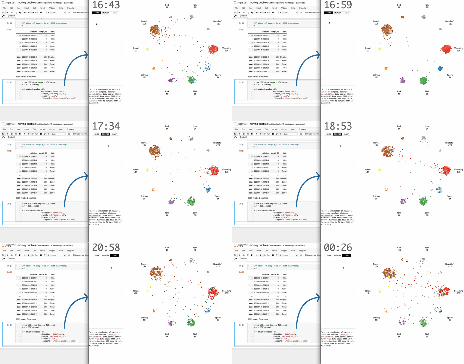
It is elegant animation that depicts the movements of entities across time. They are particularly useful for determining when clusters appear in the data and at what state(s).
I always wondered how one can create them in Python.
Turns out, there’s a pretty simple way to do it just three lines of Python using D3Blocks.
The library utilizes the graphics of the popular d3js Javascript library to create visually appealing charts with only a few lines of Python code.
To create a moving bubbles chart, you can use the d3.movingbubbles() method.
The input should be a Pandas DataFrame. Each row should represent the state of a sample at a particular timestamp, as depicted below:
After aligning the DataFrame in the desired format, you can create the moving bubbles chart as follows:
This will create an HTML file. You can preview it in a browser or open it in Jupyter directly using the IPython library.
Isn’t that cool?
👉 Over to you: What other charts do you love creating in Python?
👉 If you liked this post, don’t forget to leave a like ❤️. It helps more people discover this newsletter on Substack and tells me that you appreciate reading these daily insights. The button is located towards the bottom of this email.
Thanks for reading!
Whenever you’re ready, here are a couple of more ways I can help you:
Get the full experience of the Daily Dose of Data Science. Every week, receive two curiosity-driven deep dives that:
Make you fundamentally strong at data science and statistics.
Help you approach data science problems with intuition.
Teach you concepts that are highly overlooked or misinterpreted.
Promote to 30,000 subscribers by sponsoring this newsletter.
👉 Tell the world what makes this newsletter special for you by leaving a review here :)
👉 If you love reading this newsletter, feel free to share it with friends!


Very usefull, thank you.
very informative, thank you !