How to Create the Elegant Racing Bar Chart in Python?
...in just a couple of lines of code.
I often come across the racing bar charts in many LinkedIn posts.
I am sure you would have seen them too.
It is an elegant animation that depicts the progress of multiple categories over time.
I always wondered how one can create them in Python.
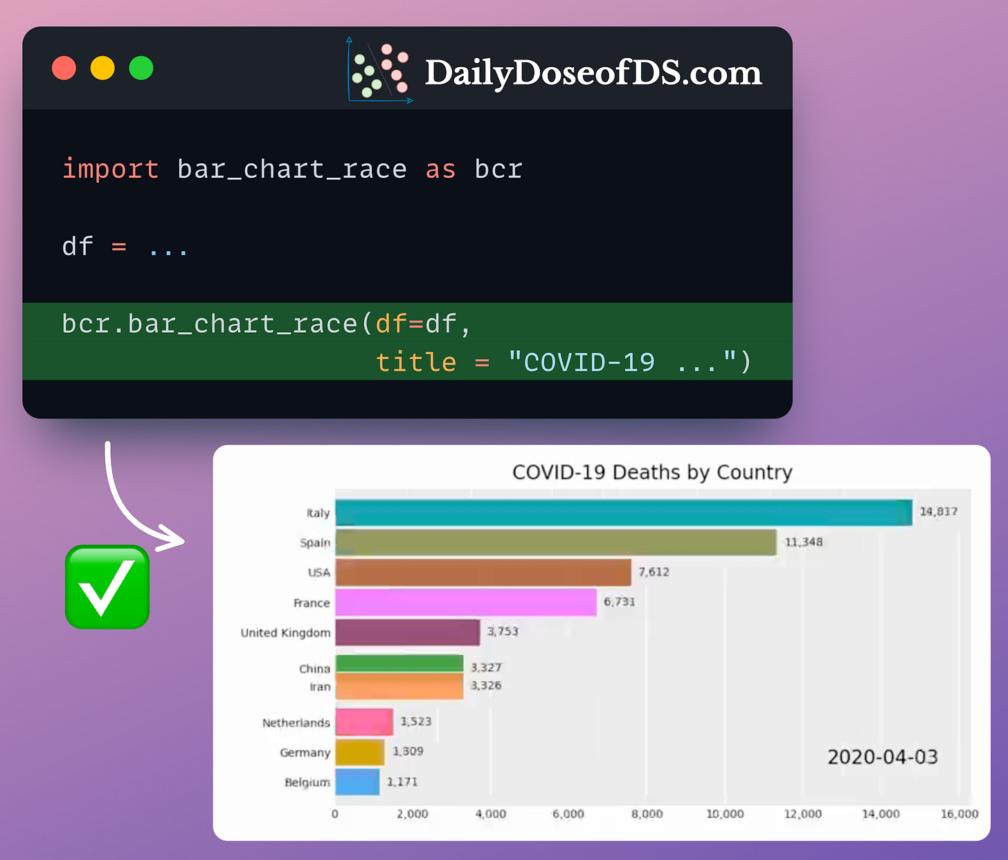
Turns out, there’s a pretty simple way to do it just a couple of lines of Python code using Bar-chart-race.
To create a racing bar chart, you can use its bar_chart_race() method.
The input must be a Pandas DataFrame:
Every row should represent a specific period of time
Each column should hold the value for a particular category
The index may contain the time component
After aligning the DataFrame in the desired format, you can create the racing bar chart as follows:
This will create the racing bar chart right in your Jupyter notebook.
Isn’t that cool?
👉 Over to you: What other charts do you love creating in Python?
👉 If you liked this post, don’t forget to leave a like ❤️. It helps more people discover this newsletter on Substack and tells me that you appreciate reading these daily insights. The button is located towards the bottom of this email.
Thanks for reading!
Hey there!
Today, I want to share one of the biggest achievements of this newsletter.
A few days back, ByteByteGo — the #1 technology newsletter on Substack, recommended the Daily Dose of Data Science to its readers.
Alex Xu, the founder of ByteByteGo, reached out and he was really appreciative of the quality this newsletter has been consistently delivering to its readers. This felt truly amazing as we had never talked before.
Hearing from Alex felt like a dream come true because I have drawn plenty of inspiration from Alex’s work:
When I noticed his free system design book, I created one from my posts, which currently has over 300+ posts.
The design of his posts helped me create better designs for my posts.
Learning more about how he structured his LinkedIn posts inspired me to write better copies for my stuff.
I am grateful to everyone who has appreciated my work and helped this newsletter rise to where it is today.
Thinking retrospectively, I could have never imagined that serving you with daily insights would turn out to be so rewarding.
What’s more, it’s almost been a month since I added a premium plan to the Daily Dose of Data Science.
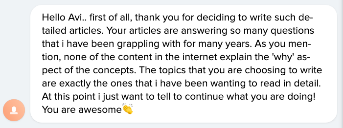
And already, so many readers are appreciating the value these in-depth reads are providing them:
Thanks again for all the support. I could not have asked for anything better 😇.
Your biggest fan,
Avi
Whenever you’re ready, here are a couple of more ways I can help you:
Get the full experience of the Daily Dose of Data Science. Every week, receive two deep dives that:
Make you fundamentally strong at data science and statistics.
Help you approach data science problems with intuition.
Teach you concepts that are highly overlooked or misinterpreted.
Promote to 32,000 subscribers by sponsoring this newsletter.
👉 Tell the world what makes this newsletter special for you by leaving a review here :)
👉 If you love reading this newsletter, feel free to share it with friends!


