Introduction to Quantile Regression
Going beyond point estimates.
Regression models typically generate a point estimate, which, in many cases, isn’t entirely useful.
Consider a model that has gathered data from several job roles and predicts the expected salary based on job title, years of experience, education level, etc. The plot may look as follows:
A traditional regression model will provide a scalar salary estimate based on the inputs.
More specifically, the prediction is a mean value related to the outcome at a particular input. If you read the article on generalized linear models, we discussed it there too.
But a single value of, say, $80k isn’t quite useful, is it?
Instead, what could be more useful is to get an expected range or quantiles to help you better assess the best-case and worst-case scenarios:
25th percentile → $65k. This means that 25% of employees in similar roles earn $65k or less.
50th percentile (the median) → $80k. This represents the middle point in the distribution.
75th percentile → $95k. This means that 25% of employees earn $95k or more.
In fact, following this process makes sense since there’s always a distribution along the target variable, and a point estimate does not fully reflect that by just outputting the mean:
Quantile regression solves this.
What is Quantile Regression?
As the name suggests, quantile regression is used to estimate the quantiles of the response variable conditioned on the input.
Unlike ordinary least squares (OLS) or linear regression, which estimates the mean of the dependent variable for given values of the predictors, quantile regression can provide estimates for various quantiles, such as the 25th, 50th, and 75th percentiles.
How does it work?
The idea is pretty simple and straightforward.
Consider the dummy dataset below and the linear regression fit:
According to this regression fit:
Points marked in green have a positive error (
=true-predicted).Points marked in red have a negative error (
=true-prediced).
Now, here’s a trick we can use.
To generate the 75% percentile line (or any percentile ABOVE 50%, for that matter), let’s assign more weight to the green data points. This will generate a prediction line closer to the green points:
Similarly, to generate the 25% percentile line (or any percentile BELOW 50%, for that matter), let’s assign more weight to the red data points. This will generate a prediction line closer to the red points:
To put it another way, the standard error term in linear regression and its graph is represented below:
In the above plot, predictions equidistant on either side of the actual value are assigned an equal loss value.
However, this loss function can be parameterized with a parameter “w” so that the loss value is different on either side:
If w>0.5, we get the plot on the left, and if w<0.5, we get the plot on the right:
Note: The above loss function is also known as quantile loss, or pinball loss.
As a result, we can train multiple regression models, one model per quantile parameter w, to get a collection of quantile regression models.
More specifically:
To get the 75th percentile model, train a regression model with
w=0.75.To get the 50th percentile model, train a regression model with
w=0.50.To get the 25th percentile model, train a regression model with
w=0.25.
Done!
During inference, pass the input example through each of the quantile-specific models to get the quantile-level predictions:
Simple, isn’t it?
Implementation from scratch
Consider the following dummy dataset along with its OLS regression fit:
As discussed earlier, the idea is to train multiple regression models, one for every quantile value we want to predict.
The loss will be calculated using the following function:
Here’s a function that computes this based on a specific weight parameter (w) and model weights (θ):
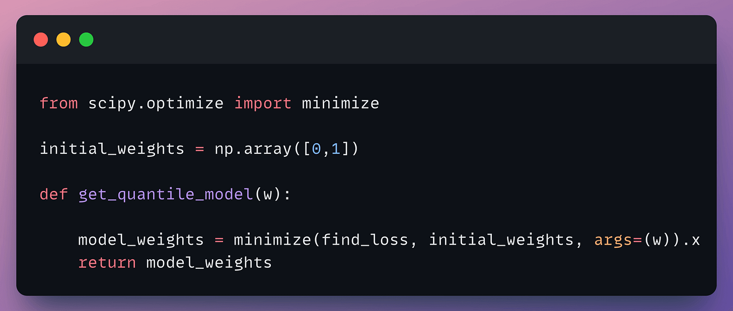
Now, to obtain the optimal weights, we shall use the minimize method from Scipy as follows:
In the above code minimize() is a function from the scipy.optimize module that performs optimization. It returns the values of the parameters that minimize the objective function (here, find_loss).
Done!
Running the function for 5 different values of the parameter w, we get the following plots:
It is evident that as the value of the parameter w increases, the line moves upwards towards higher quantiles.
In my experience, quantile regression models typically work pretty well with tree-based regression models.
In fact, models like lightgbm regression inherently support quantile objection functions.
👉 Over to you: Can you train a neural network with a quantile loss? If yes, what would the procedure look like?
Are you overwhelmed with the amount of information in ML/DS?
Every week, I publish no-fluff deep dives on topics that truly matter to your skills for ML/DS roles.
For instance:
Conformal Predictions: Build Confidence in Your ML Model’s Predictions
Quantization: Optimize ML Models to Run Them on Tiny Hardware
5 Must-Know Ways to Test ML Models in Production (Implementation Included)
Implementing Parallelized CUDA Programs From Scratch Using CUDA Programming
You Are Probably Building Inconsistent Classification Models Without Even Realizing
And many many more.
Join below to unlock all full articles:
SPONSOR US
Get your product in front of 87,000 data scientists and other tech professionals.
Our newsletter puts your products and services directly in front of an audience that matters — thousands of leaders, senior data scientists, machine learning engineers, data analysts, etc., who have influence over significant tech decisions and big purchases.
To ensure your product reaches this influential audience, reserve your space here or reply to this email to ensure your product reaches this influential audience.


