Most Important Plots in Data Science
...in a single frame.
Referral rewards for you
Referrals are now available to earn rewards listed below:
1 Referral: Unlock 450+ practice questions on NumPy, Pandas, and SQL.
2 Referrals: Get access to advanced Python OOP deep dive.
3 Referrals: Get access to the PySpark deep dive for big-data mastery.
Get your unique referral link:
Let’s get to today’s post now!
Visualizations are critical in understanding complex data patterns and relationships.
They offer a concise way to understand the:
intricacies of statistical models
validate model assumptions
evaluate model performance, and much more.
Thus, it is important to be aware of the most important and helpful plots in data science.
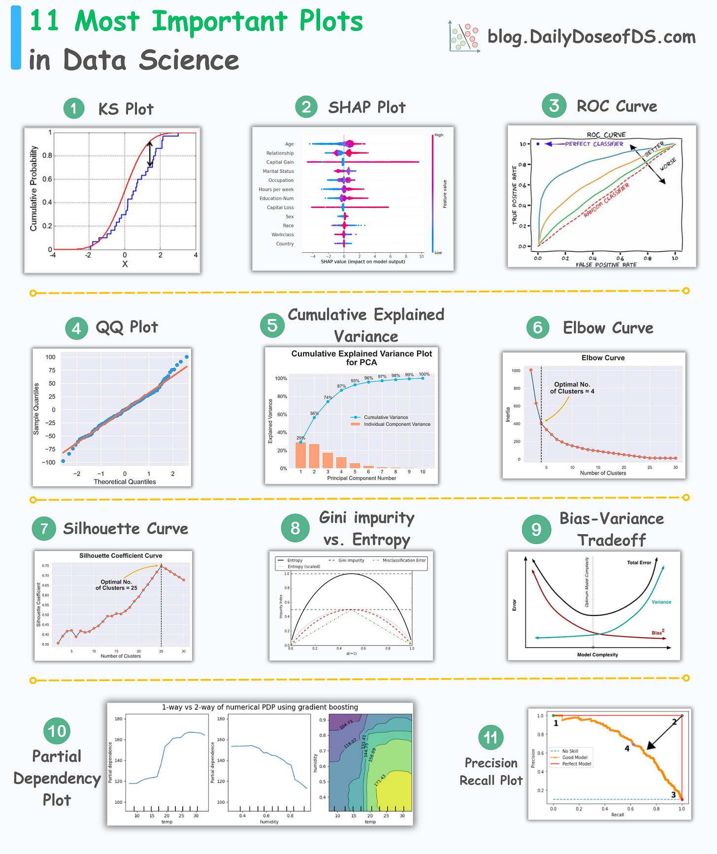
The visual below depicts the 11 most important and must-know plots in data science:
Today, let’s understand them briefly and how they are used.
KS Plot:
It is used to assess the distributional differences.
The core idea is to measure the maximum distance between the cumulative distribution functions (CDF) of two distributions.
The lower the maximum distance, the more likely they belong to the same distribution.
Thus, instead of a “plot”, it is mainly interpreted as a “statistical test” to determine distributional differences.
SHAP Plot:
It summarizes feature importance to a model’s predictions by considering interactions/dependencies between them.
It is useful in determining how different values (low or high) of a feature affect the overall output.
ROC Curve:
It depicts the tradeoff between the true positive rate (good performance) and the false positive rate (bad performance) across different classification thresholds.
The idea is to balance TPR (good performance) vs. FPR (bad performance).
Precision-Recall Curve:
It depicts the tradeoff between Precision and Recall across different classification thresholds.
QQ Plot:
It assesses the distributional similarity between observed data and theoretical distribution.
It plots the quantiles of the two distributions against each other.
Deviations from the straight line indicate a departure from the assumed distribution.
Cumulative Explained Variance Plot:
It is useful in determining the number of dimensions we can reduce our data to while preserving max variance during PCA.
Read the full article on PCA here for more clarity: Formulating the Principal Component Analysis (PCA) Algorithm From Scratch.
Elbow Curve:
The plot helps identify the optimal number of clusters for the k-means algorithm.
The point of the elbow depicts the ideal number of clusters.
Silhouette Curve:
The Elbow curve is often ineffective when you have plenty of clusters.
Silhouette Curve is a better alternative, as depicted above.
Gini-Impurity and Entropy:
They are used to measure the impurity or disorder of a node or split in a decision tree.
The plot compares Gini impurity and Entropy across different splits.
This provides insights into the tradeoff between these measures.
Bias-Variance Tradeoff:
It’s probably the most popular plot on this list.
It is used to find the right balance between the bias and the variance of a model against complexity.
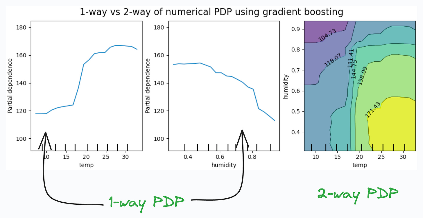
Partial Dependency Plots:
Depicts the dependence between target and features.
A plot between the target and one feature forms → 1-way PDP.
A plot between the target and two feature forms → 2-way PDP.
In the leftmost plot, an increase in temperature generally results in a higher target value.
👉 Over to you: Which important plots have I missed here?
Thanks for reading!
Extended piece #1
There’s so much data on your mobile phone right now — images, text messages, etc.
And this is just about one user — you.
But applications can have millions of users. The amount of data we can train ML models on is unfathomable.
The problem?
This data is private.
So you cannot consolidate this data into a single place to train a model.
The solution?
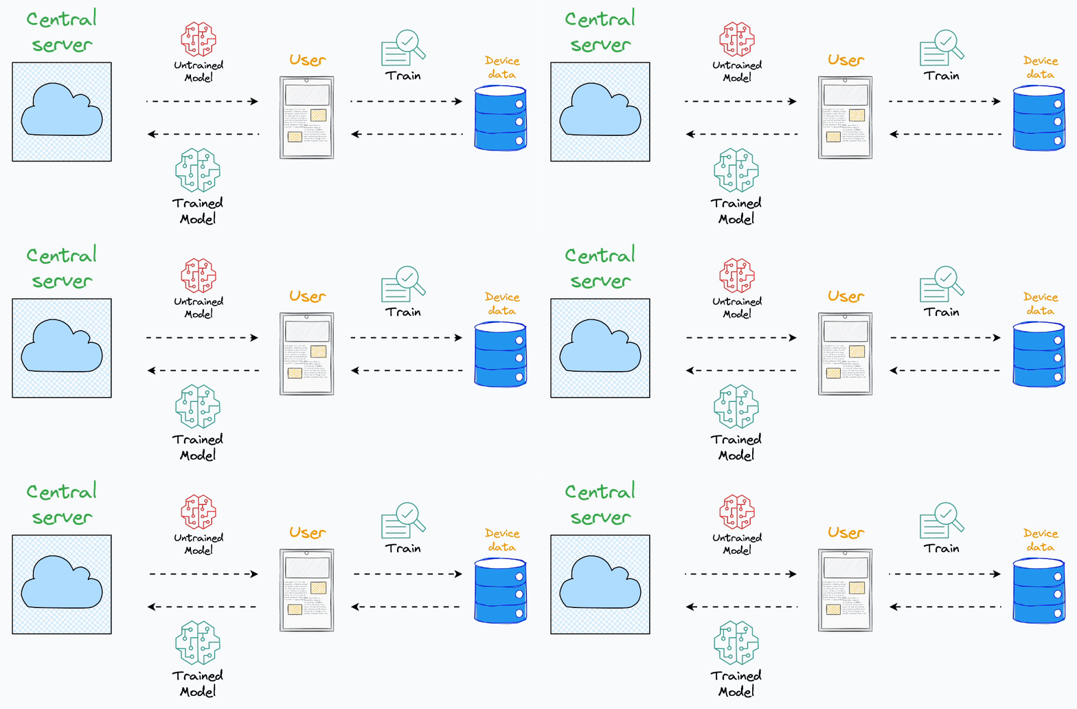
Federated learning is a smart way to address this challenge.
The core idea is to ship models to devices, train the model on the device, and retrieve the updates:
Lately, more and more users have started caring about their privacy.
Thus, more and more ML teams are resorting to federated learning to build ML models, while still preserving user privacy.
Learn about Federated Learning here (entirely beginner-friendly): Federated Learning: A Critical Step Towards Privacy-Preserving Machine Learning.
Extended piece #2
Linear regression is powerful, but it makes some strict assumptions about the type of data it can model, as depicted below.
Can you be sure that these assumptions will never break?
Nothing stops real-world datasets from violating these assumptions.
That is why being aware of linear regression’s extensions is immensely important.
Generalized linear models (GLMs) precisely do that.
They relax the assumptions of linear regression to make linear models more adaptable to real-world datasets.
👉 Read it here: Generalized linear models (GLMs).
Are you preparing for ML/DS interviews or want to upskill at your current job?
Every week, I publish in-depth ML dives. The topics align with the practical skills that typical ML/DS roles demand.
Join below to unlock all full articles:
👉 If you love reading this newsletter, share it with friends!
👉 Tell the world what makes this newsletter special for you by leaving a review here :)


