
Prompt, Context, Harness & Loop Engineering
...explained visually.

Fine-tuning fails at data prep, not at training.
Getting raw records into clean JSONL, deduped and correctly formatted, routinely takes longer than the training run itself.
Then comes hyperparameter tuning, where a bad configuration runs for a full step before the eval reveals it was bad.
Fireworks Training Agent collapses both into two inputs, a task description in plain English and a raw data upload.
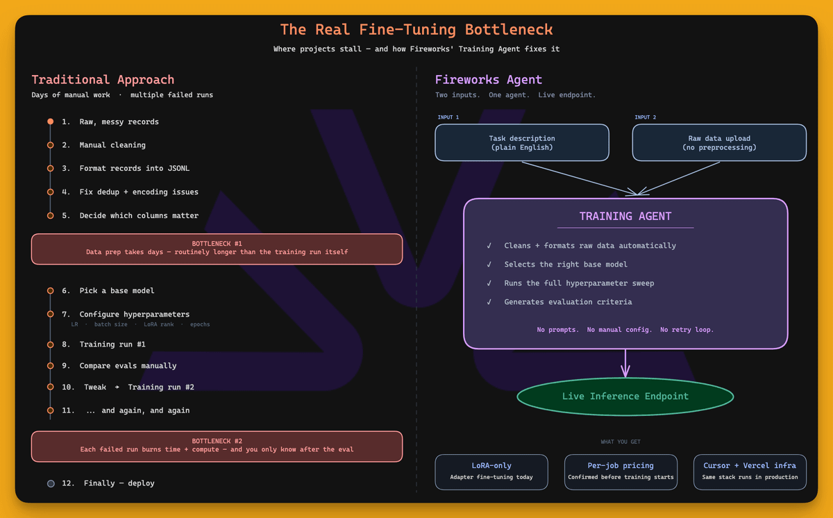
It cleans the data, selects a base model, runs a hyperparameter sweep, generates evaluation criteria, and deploys the result to a live inference endpoint, running on the same infrastructure that Cursor and Vercel use in production.
Get started with Fireworks Training Agent here →
Thanks to Fireworks for partnering today!
Prompt, context, harness & loop engineering
At its core, an agent is a while loop:
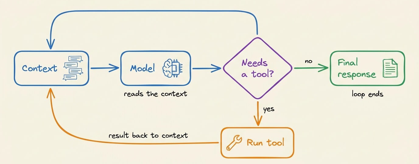
The model runs
It requests tool calls
The tool results return to the context
The model runs again until it stops requesting tools
ReAct described this form of loop back in 2022-23, and almost every agent/framework runs a similar implementation of this (we implemented ReAct from scratch in pure Python here).
But this whole loop wraps four layers of engineering around it:
Prompt engineering
Context engineering
Harness engineering
Loop engineering
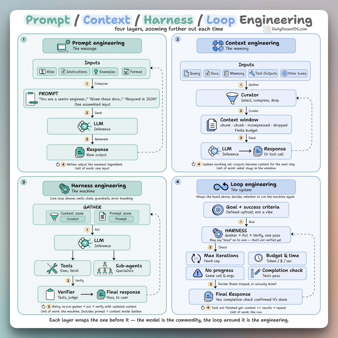
Each one wraps the last, and the model sits in the middle, so none of them compete with the others. Instead, they just zoom one level further out.
Prompt engineering:
This defines the input the model sees on one call, often composed of a role, instructions, examples, and an output format.
The techniques here alter the internal computation and reasoning the model goes through due to the wording it sees:
Chain-of-thought makes it work in steps before answering
Few-shot examples define the format and the edge cases
A JSON schema or XML tags make the output parseable by code
Self-consistency samples a few chains and takes the majority
Context engineering:
It’s everything the model sees on a turn, not just the prompt. That includes the query, retrieved docs, memory, prior turns, and tool outputs from earlier steps.
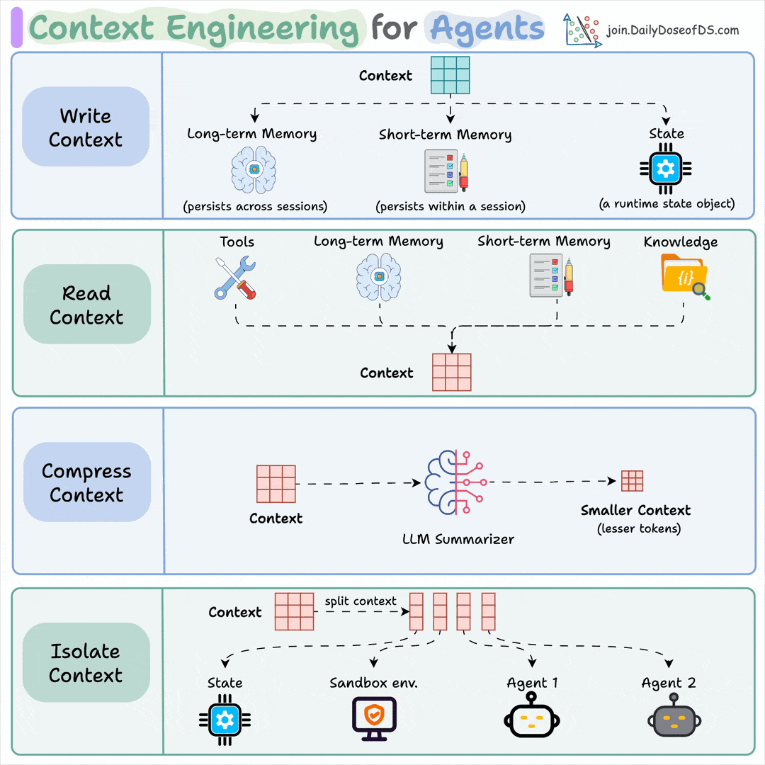
The window is finite and fills up fast, so the engineering work is to rank inputs and cut everything that isn’t pulling weight.
You do this by:
Retrieving only the chunks relevant to the query, then reranking them
Keeping key facts out of the middle, where accuracy drops
Summarizing old turns, evict stale outputs, push big blobs to files
Harness engineering:
It’s the code around the model that defines the tools, parses the calls, retries on failure, and can route work to sub-agents so one handles retrieval and another handles code.
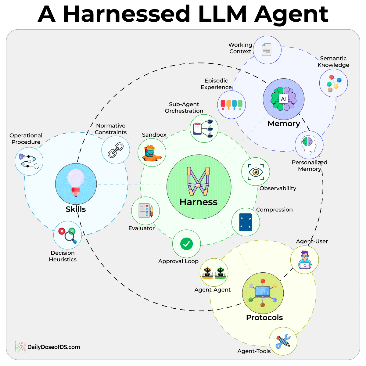
A verifier then grades the result by running tests, validating a schema, etc.
Prompt and context involve getting one call right. The harness involves everything that has to happen around that call for it to run in a real system.
Loop engineering:
In the usual setup, you manage the outer loop, i.e, you write a prompt, read the turns the agent runs, write the next prompt, and repeat, while catching failures.
This layer hands that job to the agent itself. It kicks off on a schedule or an event, and runs many turns with no prompt in between.
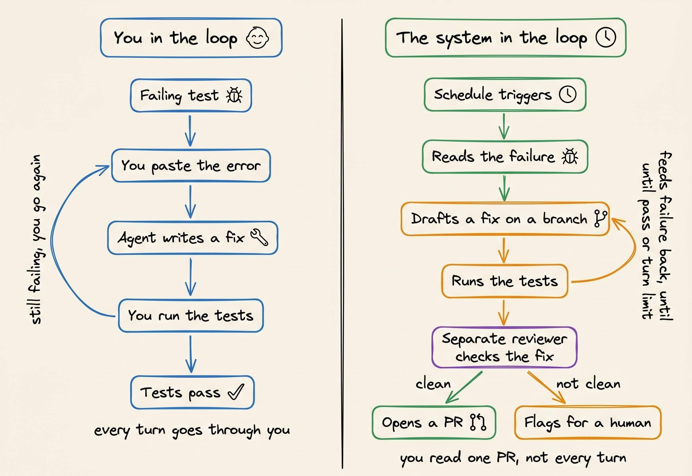
A loop inherently doesn’t know when it’s finished. An agent can report that it’s done and halt while the tests still fail. So the stop can’t be the agent’s word, but rather it has to be a real signal, like:
A turn and token cap to stop stuck runs
A no-progress detector to catch repeated calls
A completion check to verify the goal with a separate model or a deterministic test
By this layer, you’re operating on the whole run, so the engineering moves from writing each prompt to setting the goal and the stop conditions up front and letting it run.
If you want to dive deeper into loop engineering, we wrote a full breakdown of loop engineering recently.
It goes from the basic while loop to a run that finishes on its own, with the code behind each part, and the parts that are hard to get right, like knowing when to stop, context rot over a long run, and keeping the checker separate from the maker.
11 most important plots in DS/ML
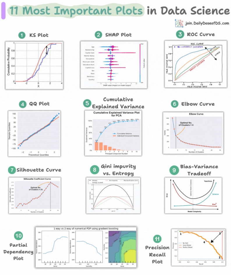
This visual depicts the 11 most important and must-know plots in DS:
Today, let’s understand them briefly and how they are used.
1) KS plot:

It is used to assess the distributional differences.
The idea is to measure the maximum distance between the cumulative distribution functions (CDF) of two distributions.
The lower the maximum distance, the more likely they belong to the same distribution.
2) SHAP plot:
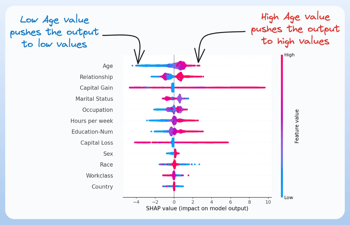
It summarizes feature importance to a model’s predictions by considering interactions/dependencies between them.
It is useful in determining how different values (low or high) of a feature affect the overall output.
We covered model interpretability extensively in our 3-part crash course. Start here: A Crash Course on Model Interpretability →
3) ROC curve:

It depicts the tradeoff between the true positive rate (good performance) and the false positive rate (bad performance) across different classification thresholds.
The idea is to balance TPR (good performance) vs. FPR (bad performance).
4) Precision-recall curve:
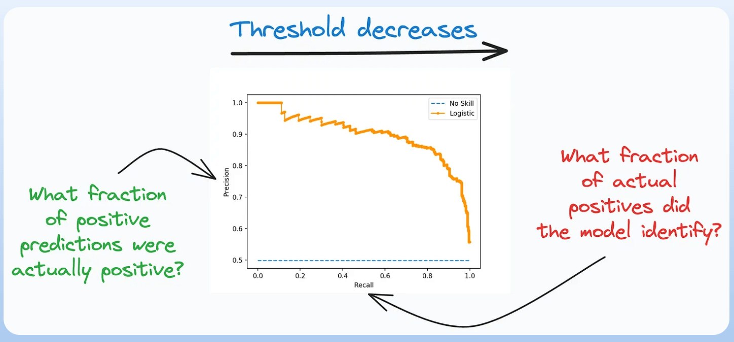
It depicts the tradeoff between Precision and Recall across different classification thresholds.
5) QQ plot:
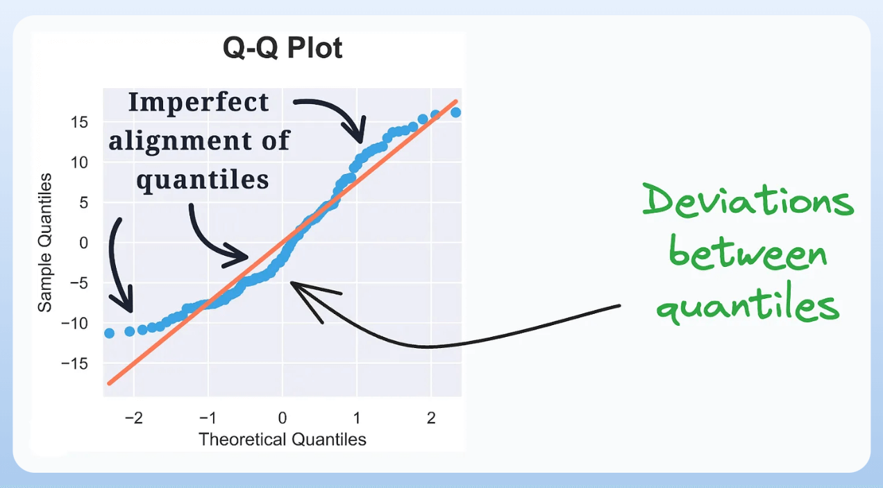
It assesses the distributional similarity between observed data and theoretical distribution.
It plots the quantiles of the two distributions against each other.
Deviations from the straight line indicate a departure from the assumed distribution.
6) Cumulative explained variance plot:
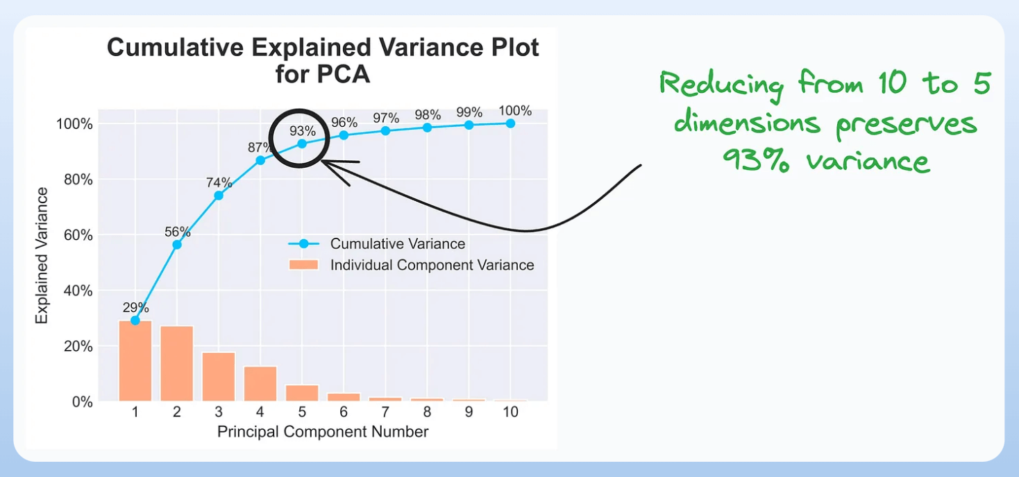
It is useful in determining the number of dimensions we can reduce our data to while preserving max variance during PCA.
Read the full article on PCA here for more clarity: Formulating the Principal Component Analysis (PCA) Algorithm From Scratch.
7) Elbow curve:

The plot helps identify the optimal number of clusters for the k-means algorithm.
The point of the elbow depicts the ideal number of clusters.
8) Silhouette curve:

The Elbow curve is often ineffective when you have plenty of clusters.
Silhouette Curve is a better alternative, as depicted above.
9) Gini-Impurity and entropy:

They are used to measure the impurity or disorder of a node or split in a decision tree.
The plot compares Gini impurity and Entropy across different splits.
This provides insights into the tradeoff between these measures.
10) Bias-variance tradeoff:

It’s probably the most popular plot on this list.
It is used to find the right balance between the bias and the variance of a model against complexity.
11) Partial dependency plots:

Depicts the dependence between target and features.
A plot between the target and one feature forms → 1-way PDP.
A plot between the target and two feature forms → 2-way PDP.
In the leftmost plot, an increase in temperature generally results in a higher target value.
We covered model interpretability extensively in our 3-part crash course. Start here: A Crash Course on Model Interpretability →
👉 Over to you: Which important plots have I missed here?