
Ridgeline Plots to Depict Multiple Distributions
Search trends of 2024.

Speech-to-text at unmatched accuracy with AssemblyAI
There are two techniques to identify and generate speaker-labeled transcripts from speech files:
Multichannel transcription: Each speaker has a dedicated channel (conference calls, zoom meetings, etc.), leading to better accuracy.
Speaker diarization: All speakers belong to the same channel, which requires sophisticated techniques.
AssemblyAI’s SOTA transcription models can tackle both of them seamlessly in just six lines of code:
For multichannel transcription, set
multichannel=True:

For speaker diarization, set
speaker_labels=Trueandspeakers_expected:

speakers_expected is optional but recommended.AssemblyAI’s speech-to-text models rank top across all major industry benchmarks. You can transcribe 1 hour of audio in ~35 seconds at an industry-leading accuracy of >93% (for English).
Sign up today and get $50 in free credits!
Thanks to AssemblyAI for partnering with us on today’s issue.
Ridgeline plots to depict multiple distributions
Plotting the distributions of two groups in your data can produce something like this:

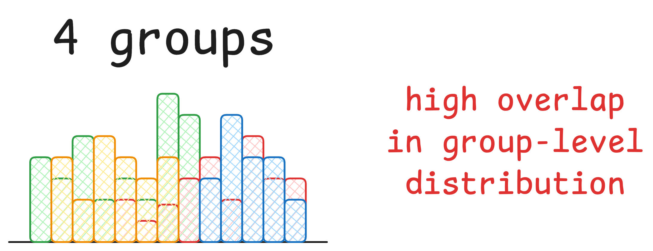
But things become increasingly cluttered when you have more groups:

Ridgeline plots (shown below) solve this:

They let us compare the distributions of multiple groups side by side and understand how they differ.
The plot below is another classic example of Ridgeline plots. It depicts the search interest across 2024:
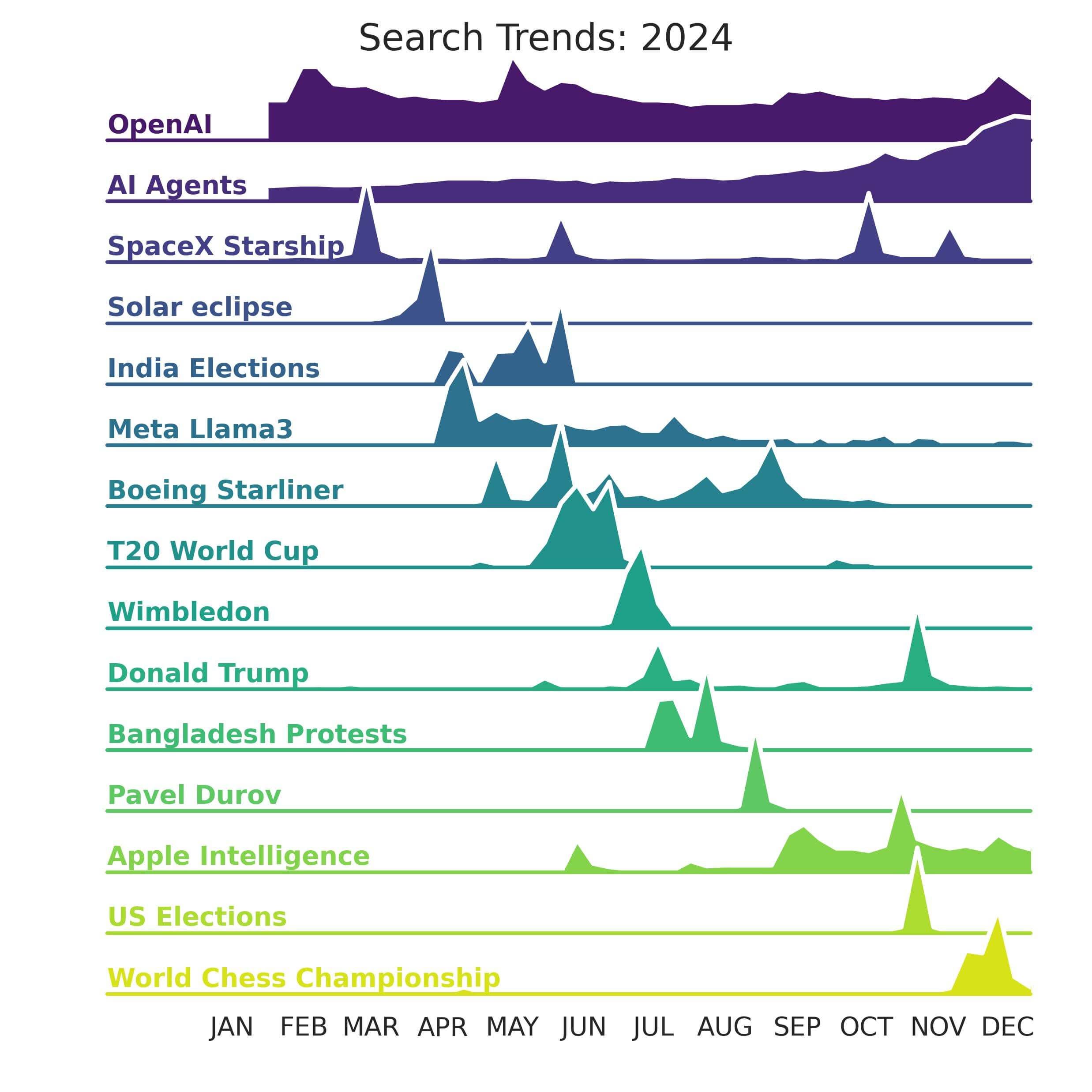
Isn't it easy to visualize? I created this using the Joypy library.
When to consider Ridgeline plot?
Typically, creating a Ridgeline plot makes sense when the variable has more than 3-4 groups:
Also, I have found that ridgeline plots are relatively more useful when there is a clear pattern and/or ranking between groups like:
monotonically increasing,
monotonically decreasing,
increasing then decreasing (and so on)…
decreasing then increasing (and so on)…
That is why the order in which you vertically stack the groups is quite important.
For instance, consider the above “Search trends” plot again but with a random arrangement of news topics:

The plot on the left is much easier to comprehend.
👉 Over to you: What are some other gems of data visualization that deserve more attention?
P.S. For those wanting to develop “Industry ML” expertise:

At the end of the day, all businesses care about impact. That’s it!
Can you reduce costs?
Drive revenue?
Can you scale ML models?
Predict trends before they happen?
We have discussed several other topics (with implementations) in the past that align with such topics.
Here are some of them:
Learn sophisticated graph architectures and how to train them on graph data: A Crash Course on Graph Neural Networks – Part 1.
So many real-world NLP systems rely on pairwise context scoring. Learn scalable approaches here: Bi-encoders and Cross-encoders for Sentence Pair Similarity Scoring – Part 1.
Learn techniques to run large models on small devices: Quantization: Optimize ML Models to Run Them on Tiny Hardware.
Learn how to generate prediction intervals or sets with strong statistical guarantees for increasing trust: Conformal Predictions: Build Confidence in Your ML Model’s Predictions.
Learn how to identify causal relationships and answer business questions: A Crash Course on Causality – Part 1
Learn how to scale ML model training: A Practical Guide to Scaling ML Model Training.
Learn techniques to reliably roll out new models in production: 5 Must-Know Ways to Test ML Models in Production (Implementation Included)
Learn how to build privacy-first ML systems: Federated Learning: A Critical Step Towards Privacy-Preserving Machine Learning.
Learn how to compress ML models and reduce costs: Model Compression: A Critical Step Towards Efficient Machine Learning.
All these resources will help you cultivate key skills that businesses and companies care about the most.