Sparklines: The Hidden Gem of Data Visualisation That Deserve Much More Attention
A concise and elegant way to create visualisations.
When doing any data analysis task in Jupyter, we mostly create standalone charts and visualizations.
Of course, there’s nothing wrong, but today, let me introduce you to another pretty cool and elegant way I often use to create visualizations in Jupyter Notebook.
Background:
Whenever we display a DataFrame in Jupyter, it is rendered using HTML and CSS.
This means that we can format its output just like any other web page.
Moreover, when we create any plot in Jupyter, it is rendered as an image.
However, the same image can also be rendered within an HTML image tag in Jupyter.
And magic happens when we combine the above two ideas — rendering plots inside a DataFrame, as depicted below:
Formally, these compact plots are called Sparklines, and they provide a pretty elegant way to visualize data without taking up too much space.
Unlike traditional plots, we typically do not create axis ticks and labels in Sparklines.
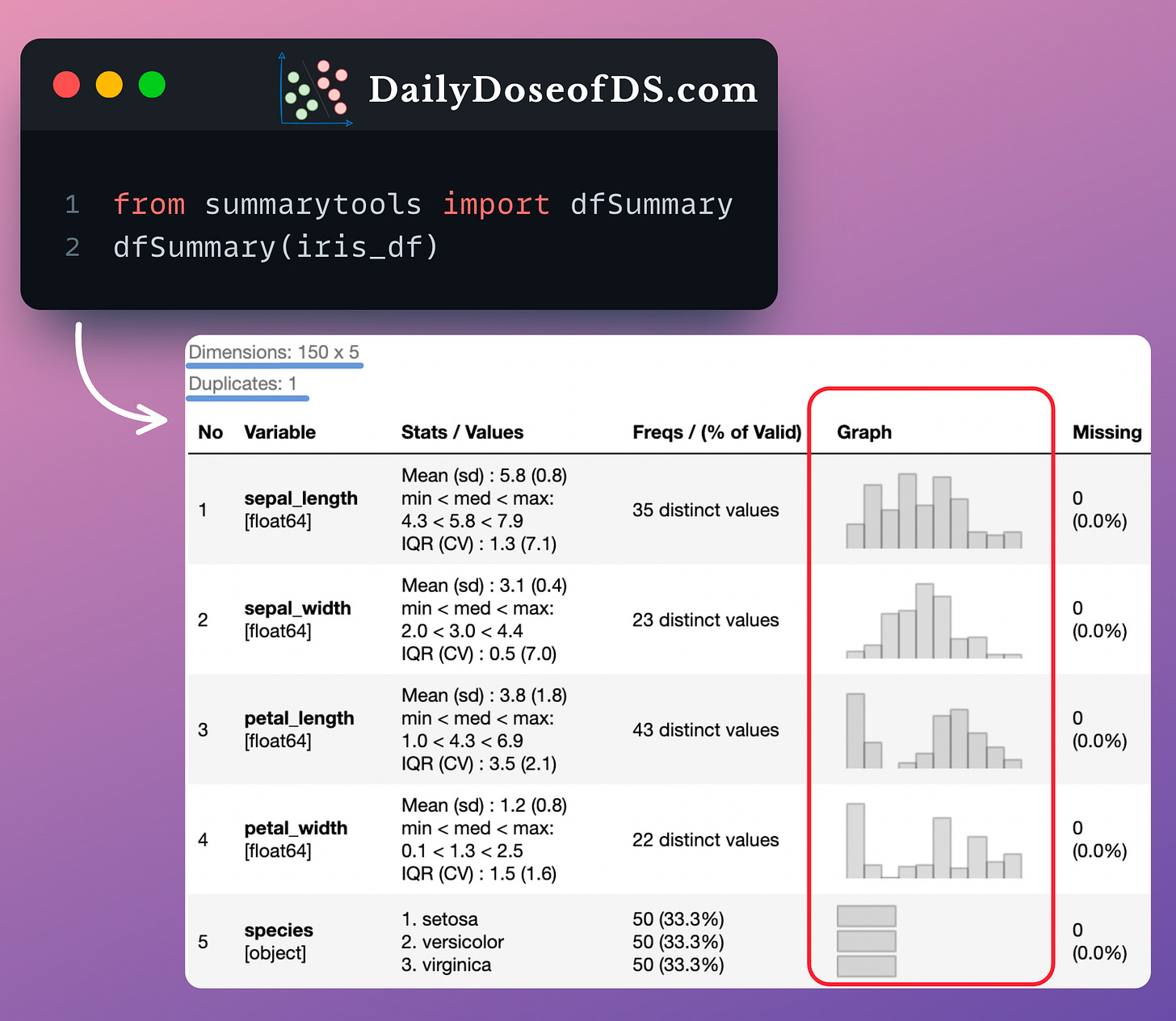
One of the coolest ways I prefer using Sparklines is by adding them to a DataFrame’s cell, as depicted in the image above.
In fact, if you remember the newsletter issue in which we discussed SummaryTools, this is precisely how the SummaryTools library creates the “Graph” column:
Pretty cool, isn’t it?
You can download my Jupyter Notebook to learn how to create Sparkline plots: Sparkline Plot Notebook.
In this notebook, I have provided the step-by-step procedure to embed Sparklines in a DataFrame.
👉 Over to you: What are some other cool and lesser-known ways to create data visualizations?
👉 If you liked this post, don’t forget to leave a like ❤️. It helps more people discover this newsletter on Substack and tells me that you appreciate reading these daily insights.
The button is located towards the bottom of this email.
Thanks for reading!
Latest full articles
If you’re not a full subscriber, here’s what you missed last month:
You Cannot Build Large Data Projects Until You Learn Data Version Control!
Why Bagging is So Ridiculously Effective At Variance Reduction?
Sklearn Models are Not Deployment Friendly! Supercharge Them With Tensor Computations.
Deploy, Version Control, and Manage ML Models Right From Your Jupyter Notebook with Modelbit
Gaussian Mixture Models (GMMs): The Flexible Twin of KMeans.
To receive all full articles and support the Daily Dose of Data Science, consider subscribing:
👉 Tell the world what makes this newsletter special for you by leaving a review here :)
👉 If you love reading this newsletter, feel free to share it with friends!


