The Best of Daily Dose of Data Science Newsletter (2023)
A recap of the 10 best posts of 2023.
As we come to the end of this year, I am pretty excited to do a rewind of the 10 best posts published in this newsletter in 2023.
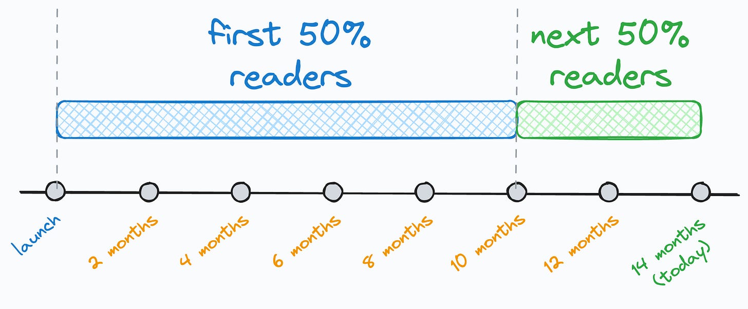
I think this post is pretty important for many of you because while looking at the stats today, I noticed that 50% of you (around 28k) have joined this newsletter in the last 4 months.
And to give you a bit more context, I have been writing this daily newsletter for 14 months now.
Thus, many of you may have missed some posts, which will be super important for your skill upliftment.
So these are the 10 top posts (in my opinion) of the 451 posts I have published so far in this newsletter (in no particular order).
#1) How to read the Statsmodel regression summary?
Statsmodel provides one of the most comprehensive summaries for regression analysis. But most people struggle to interpret the critical model details mentioned in this report.
Read this post to learn how to read this regression summary.
#2) How zero-inflated datasets ruin your regression modeling
The target variable of typical regression datasets is somewhat evenly distributed.
But, at times, the target variable may have plenty of zeros. Such datasets are called zero-inflated datasets, and they can cause some serious trouble in building regression models.
Read this issue to learn more about how to handle zero-inflated datasets.
#3) The most overlooked source of optimization in data pipelines
When building data pipelines, most programmers dedicate optimization efforts (run-time and memory) to the algorithmic side.
But very few realize the profound improvements they can get by optimizing the I/O-related operations.
Read this post to learn more about optimizing I/O in data pipelines.
#4) How to handle Multivariate covariate shift
Almost all real-world ML models gradually degrade in performance due to Covariate shift. It happens when the distribution of features changes over time.
The most common approaches to measuring distributional differences may not be useful because they are univariate in nature, i.e., they only work on one feature at a time.
But in real life, we may observe multivariate covariate shift as well, as depicted below:
How to handle this?
There’s a three-part guide to covariate shift:
Part 1: Covariate Shift Is Way More Problematic Than Most People Think
Part 2: How to Detect Multivariate Covariate Shift in Machine Learning Models?
Part 3: How to Interpret Reconstruction Loss While Detecting Multivariate Covariate Shift?
#5) The first step towards missing data imputation must NEVER be imputation
After seeing missing values in a dataset, most people jump directly into imputing them.
But the first step towards imputing missing data should NEVER be imputation. Instead, the first step must be to understand the reason behind data missingness because the data imputation strategy largely depends on WHY data is missing.
#6) You can build any linear model if you learn just one thing about them
Many overcomplicate building generalized linear models like Poisson regression, linear regression, binomial regression, logistic regression, etc.
But training linear models is just about learning one skill — UNDERSTANDING THE DATA GENERATION PROCESS. That’s it.
#7) Run-time complexity of ML algorithms
I am a big fan of open-source ML implementations like sklearn. It takes just two (max three) lines of code to run any ML algorithm with sklearn.
Yet, in my experience, due to this simplicity, most users often tend to ignore:
The core understanding of an algorithm.
The data-specific conditions that allow us to use an algorithm.
#8) Why Euclidean distance can be a misleading choice for distance metric?
Euclidean distance is profoundly used in data science. But there are some inherent assumptions that your specific dataset may not conform to.
#9) Correlation does not measure predictiveness
Many data scientists misinterpret correlation as a measure of “predictiveness.”
But this is not true. Instead, correlation just measures how two features vary with one another linearly (or monotonically).
Along the lines of summary statistics specifically, I have published many cautionary posts that you MUST read:
The Biggest Limitation of Pearson Correlation Which Many Overlook
The Limitation of Pearson Correlation While Using It With Ordinal Categorical Data.
Why Correlation (and Other Summary Statistics) Can Be Misleading?
What Makes Histograms a Misleading Choice for Data Visualisation?
#10) 8 classic alternatives to traditional plots and when to use them
Scatter plots, bar plots, line plots, box plots, and heatmaps are the most frequently used plots for data visualization.
Although they are simple and known to almost everyone, I believe they are not the right choice to cover every possible scenario.
Here, I will also include the Ridgeline plot post we discussed yesterday.
Daily Dose of Data Science in 2024
To be honest, I don’t intend to change anything in this daily newsletter because everything is going great, and the topics have been resonating pretty well with most readers lately.
Yet, if there’s ANY feedback that you may have that could help me improve my daily emails, please don’t hesitate to reach out.
Your critical feedback will help me provide YOU the best value I possibly can.
I am confident that next year will be filled with much more learning, and I feel blessed that this newsletter is contributing to your growth.
I can not wait to serve you more in 2024 :)
Cheers,
Avi


Thank you so much, always on point.