The Coolest Plotly Feature That You Have Been (Possibly) Ignoring All This Time
Enrich static plots with animations.
Most Plotly users prefer it for interactivity purposes.
Yet, very few know that they can also use it to create animated plots.
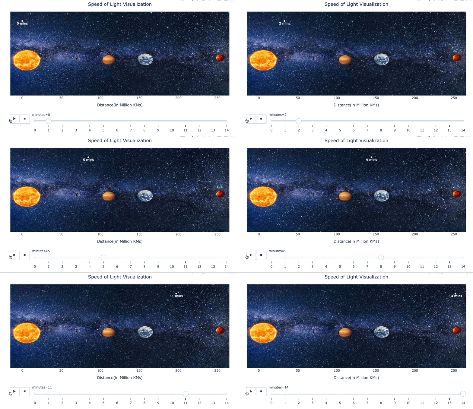
Here’s an animated visualization I created to demonstrate this idea:
It depicts the time light takes to reach different planets after leaving the Sun.
Pretty cool and elegant, isn’t it?
Let’s understand how it works.
The core idea behind creating an animated plot relies on plotting the data one frame at a time.
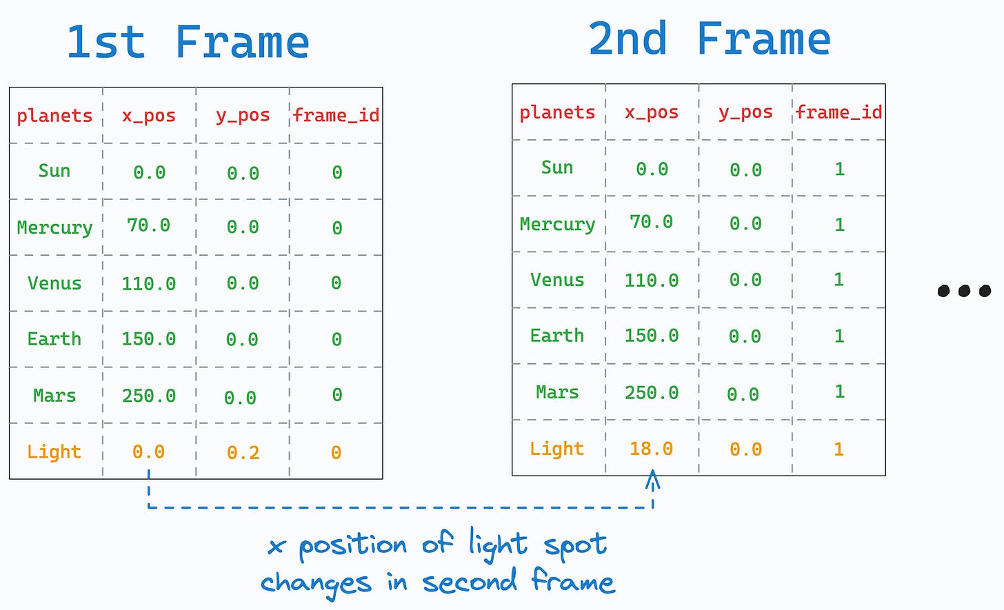
Thus, we must gather our data in a single DataFrame, with one column representing the frame_id, as shown below:
In the above DataFrame:
The
frame_idcolumn increments at each frame.The
x_posandy_posrepresents the position of different objects at every frame:The
(x,y)position stays the same for all planets.We only update the position of the light spot.
Now, if we invoke the scatter() method and specify the animation_frame parameter as frame_id, it will plot the data frame-by-frame — generating an animation.
This is demonstrated below:
In the above function call:
The data corresponding to
frame_id=0will be plotted first.This will be replaced by the data with
frame_id=1in the next frame, and so on.
Pretty simple, isn’t it?
I find such utilities to be quite useful when I want to visualize dynamic changes or trends in categorical data over time.
Of course, in the “Speed of Light Visualisation plot,” I also added the images of planets to improve its visual appearance.
Yet, the idea is still the same.
Download this notebook to create the above plot yourself using Plotly: Plotly animated plot.
👉 Over to you: What other cool and lesser-known Plotly hacks are you aware of?
👉 If you liked this post, don’t forget to leave a like ❤️. It helps more people discover this newsletter on Substack and tells me that you appreciate reading these daily insights.
The button is located towards the bottom of this email.
Thanks for reading!
Latest full articles
If you’re not a full subscriber, here’s what you missed last month:
Don’t Stop at Pandas and Sklearn! Get Started with Spark DataFrames and Big Data ML using PySpark.
DBSCAN++: The Faster and Scalable Alternative to DBSCAN Clustering
Federated Learning: A Critical Step Towards Privacy-Preserving Machine Learning
You Cannot Build Large Data Projects Until You Learn Data Version Control!
Sklearn Models are Not Deployment Friendly! Supercharge Them With Tensor Computations.
Deploy, Version Control, and Manage ML Models Right From Your Jupyter Notebook with Modelbit
Gaussian Mixture Models (GMMs): The Flexible Twin of KMeans.
To receive all full articles and support the Daily Dose of Data Science, consider subscribing:
👉 Tell the world what makes this newsletter special for you by leaving a review here :)
👉 If you love reading this newsletter, feel free to share it with friends!


Thank you for showing new possibilities!