
Trace and Monitor Any AI/LLM App
+ New year sale for lifetime accounts (5 days left)!

[5 Days Left] New Year Sale for Lifetime Accounts
For the next 5 days, you can get lifetime access to Daily Dose of Data Science at 2x the yearly price instead of 3x.
Secure your Lifetime Access at a discount here →
It gives you lifetime access to our all-in-one hands-on blueprints designed specifically to succeed in AI Engineering roles:
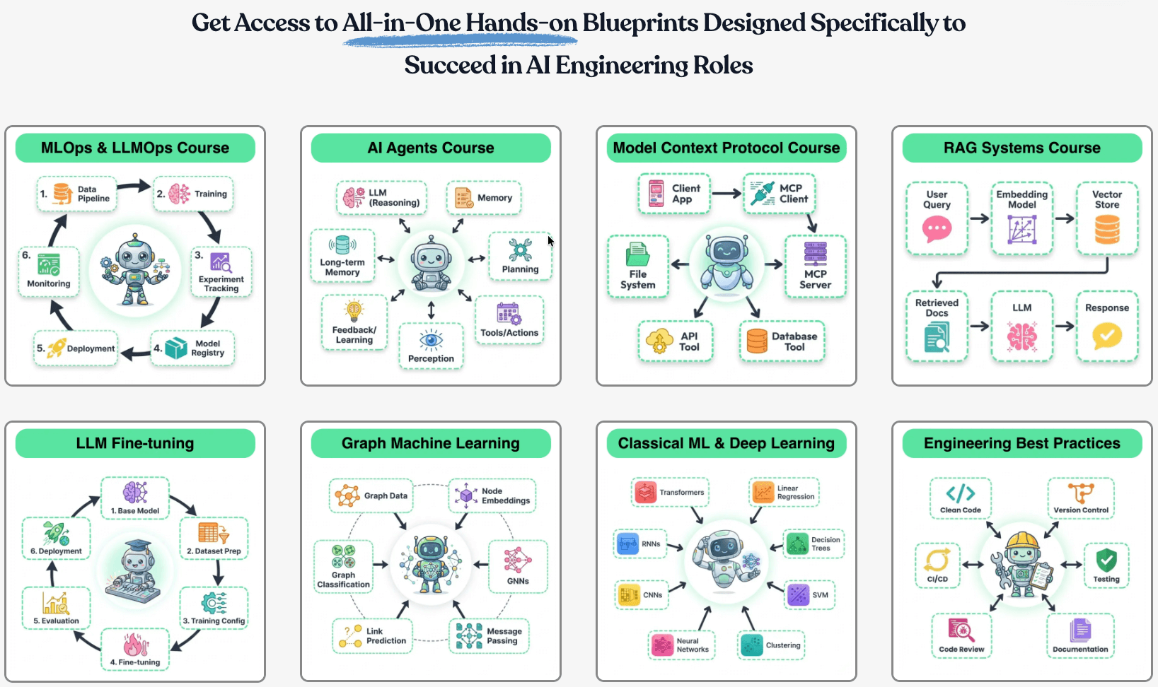
Here’s what you’ll get:
The 17-part course that covers how to build Agentic systems.
Our 18-part MLOps course that goes from first principles to production.
The full 9-part course on MCPs.
Our 7-part course on building RAG systems.
LLM fine-tuning techniques and implementations.
Our courses on graph neural networks, PySpark, model interpretability, model calibration, causal inference, and more.
Scaling ML models with implementations.
Building privacy-preserving ML systems.
Mathematical deep dives on core DS topics, clustering, etc.
From-scratch implementations of several core ML algorithms.
Building 100% reproducible ML projects.
50+ more existing industry-relevant topics.

You will get all 100+ existing resources plus every new weekly deep dive for life.
Secure your Lifetime Access at a discount here →
P.S. Our last sale was 12+ months ago. We don’t run black friday, Cyber Monday promotions, etc., and might never offer discounts again.
Join 100k+ people that we helped get promoted, get a better job, or start their own company →
P.S. If you are an existing monthly or yearly member and wish to upgrade to lifetime, please reply to this email.
Trace and Monitor Any AI/LLM App
If you are building with LLMs, you absolutely need traceability.
Opik is an open-source, production-ready end-to-end LLM evaluation platform.
It allows developers to test their LLM applications in development, before a release (CI/CD), and in production.
Here’s an example with CrewAI below:

All you need to do is this:

Put your LLM logic inside a function.
Add the
@trackdecorator.
Done!
After this, Opik will track everything within your AI application, from LLM calls (with cost) to evaluation metrics and intermediate logs.
If you want to dive further, we also published a practical guide on Opik to help you integrate evaluation and observability into your LLM apps (with implementation).
It has open access to all readers.
Start here: A Practical Guide to Integrate Evaluation and Observability into LLM Apps.
11 Most Important DS Plots
This visual depicts the 11 most important and must-know plots in DS:
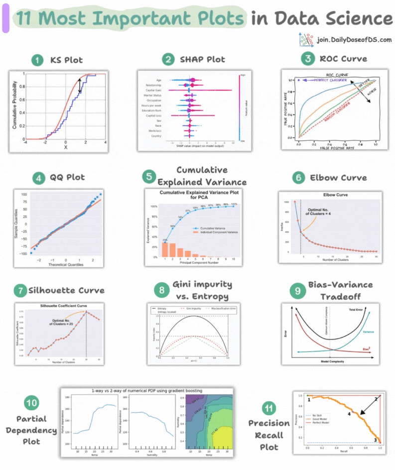
Today, let’s understand them briefly and how they are used.
1) KS Plot:

It is used to assess the distributional differences.
The idea is to measure the maximum distance between the cumulative distribution functions (CDF) of two distributions.
The lower the maximum distance, the more likely they belong to the same distribution.
2) SHAP Plot:
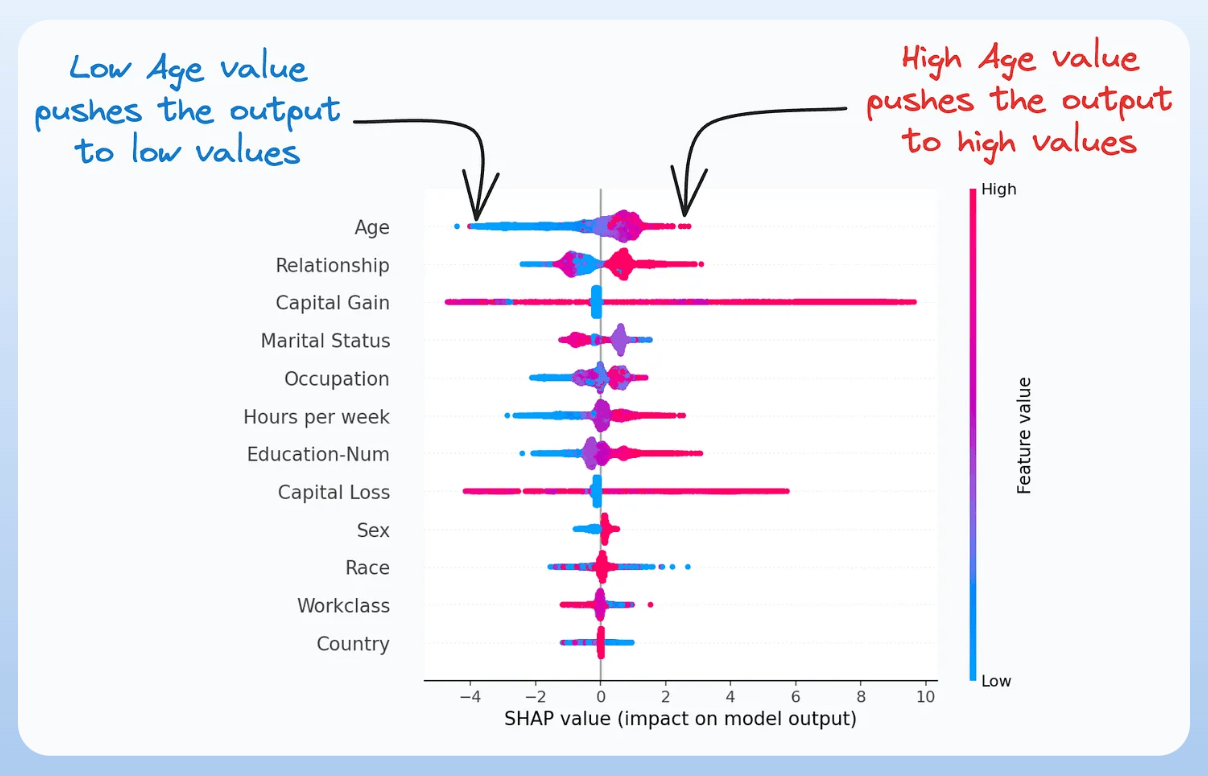
It summarizes feature importance to a model’s predictions by considering interactions/dependencies between them.
It is useful in determining how different values (low or high) of a feature affect the overall output.
We covered model interpretability extensively in our 3-part crash course. Start here: A Crash Course on Model Interpretability →
3) ROC Curve:

It depicts the tradeoff between the true positive rate (good performance) and the false positive rate (bad performance) across different classification thresholds.
The idea is to balance TPR (good performance) vs. FPR (bad performance).
4) Precision-Recall Curve:
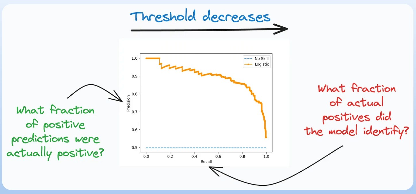
It depicts the tradeoff between Precision and Recall across different classification thresholds.
5) QQ Plot:
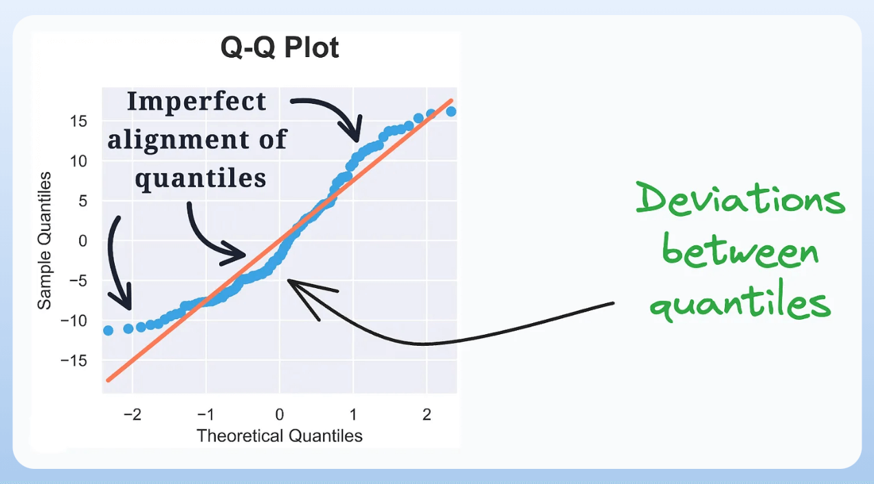
It assesses the distributional similarity between observed data and theoretical distribution.
It plots the quantiles of the two distributions against each other.
Deviations from the straight line indicate a departure from the assumed distribution.
6) Cumulative Explained Variance Plot:
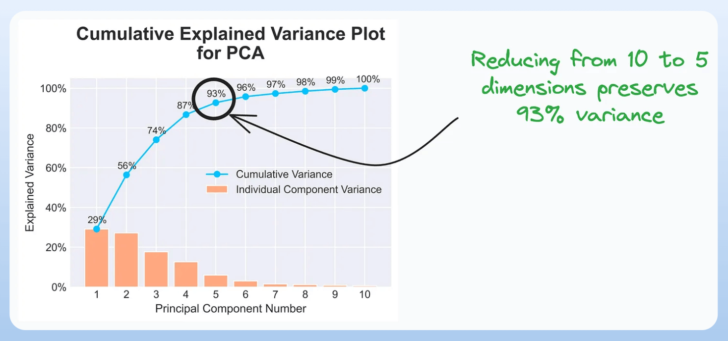
It is useful in determining the number of dimensions we can reduce our data to while preserving max variance during PCA.
Read the full article on PCA here for more clarity: Formulating the Principal Component Analysis (PCA) Algorithm From Scratch.
7) Elbow Curve:

The plot helps identify the optimal number of clusters for the k-means algorithm.
The point of the elbow depicts the ideal number of clusters.
8) Silhouette Curve:

The Elbow curve is often ineffective when you have plenty of clusters.
Silhouette Curve is a better alternative, as depicted above.
9) Gini-Impurity and Entropy:

They are used to measure the impurity or disorder of a node or split in a decision tree.
The plot compares Gini impurity and Entropy across different splits.
This provides insights into the tradeoff between these measures.
10) Bias-Variance Tradeoff:

It’s probably the most popular plot on this list.
It is used to find the right balance between the bias and the variance of a model against complexity.
11) Partial Dependency Plots:

Depicts the dependence between target and features.
A plot between the target and one feature forms → 1-way PDP.
A plot between the target and two feature forms → 2-way PDP.
In the leftmost plot, an increase in temperature generally results in a higher target value.
We covered model interpretability extensively in our 3-part crash course. Start here: A Crash Course on Model Interpretability →
👉 Over to you: Which important plots have I missed here?
Thanks for reading!