Use Box Plots with Caution! They Can Be Misleading.
...and here's how to prevent being misled by them.
Box plots are pretty common in data analysis.
Yet, they can be highly misleading at times.
Let’s understand how!
To begin, a box plot is a graphical representation of just five numbers:
min
first quartile
median
third quartile
max
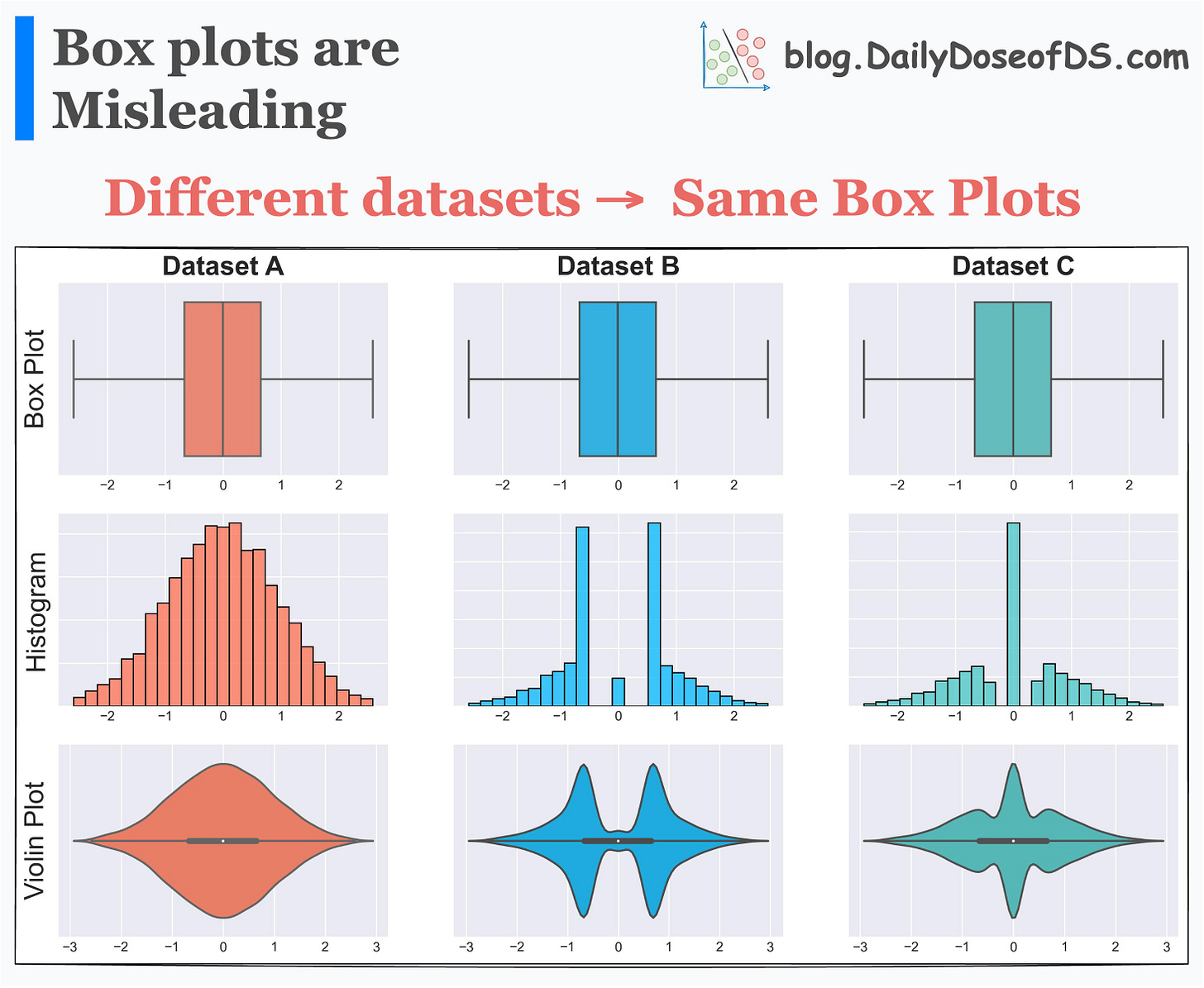
This means that if two entirely different distributions have similar five values, they will produce identical box plots.
This is evident from the image below:
As depicted above, three datasets have the same box plots, but entirely different distributions.
This shows that solely looking at a bar plot may lead to incorrect or misleading conclusions.
Here, the takeaway is not that box plots should not be used.
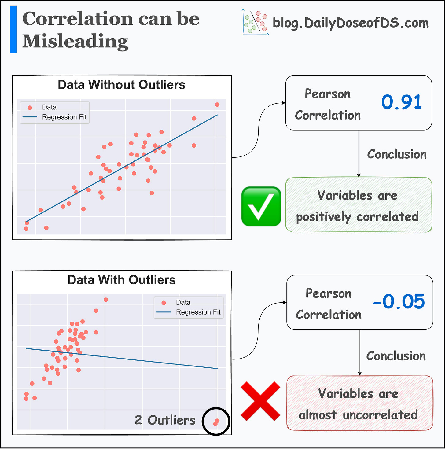
Instead, it’s similar to what we saw in one of the earlier posts about correlation: “Whenever we generate any summary statistic, we lose essential information.”
Correlation is also a summary statistic, and as shown below, adding just two outliers changes the direction of correlation:
Thus, it is always important to look at the underlying data distribution.
For instance, whenever I create a box plot, I create a violin (or KDE) plot too. This lets me validate whether summary statistics resonate with the data distribution.
In fact, I also find Raincloud plots to be pretty useful.
They provide a pretty concise way to combine and visualize three different types of plots together.
These include:
Box plots for data statistics.
Strip plots for data overview.
KDE plots for the probability distribution of data.
👉 Over to you: What other measures do you take when using summary statistics?
👉 If you liked this post, don’t forget to leave a like ❤️. It helps more people discover this newsletter on Substack and tells me that you appreciate reading these daily insights.
The button is located towards the bottom of this email.
Thanks for reading!
Latest full articles
If you’re not a full subscriber, here’s what you missed last month:
You Are Probably Building Inconsistent Classification Models Without Even Realizing
Why Sklearn’s Logistic Regression Has no Learning Rate Hyperparameter?
PyTorch Models Are Not Deployment-Friendly! Supercharge Them With TorchScript.
How To (Immensely) Optimize Your Machine Learning Development and Operations with MLflow.
DBSCAN++: The Faster and Scalable Alternative to DBSCAN Clustering.
Federated Learning: A Critical Step Towards Privacy-Preserving Machine Learning.
You Cannot Build Large Data Projects Until You Learn Data Version Control!
To receive all full articles and support the Daily Dose of Data Science, consider subscribing:
👉 Tell the world what makes this newsletter special for you by leaving a review here :)
👉 If you love reading this newsletter, feel free to share it with friends!


Great post explaining box plots, so useful but many people don’t get it!!!
Goood, thank you Avi !