Waterfall Charts: A Better Alternative to Line/Bar Plot
If you want to visualize a value over some period, a line (or bar) plot may not always be an apt choice.
A line-plot (or bar-plot) depicts the actual values in the chart. Thus, sometimes, it can get difficult to visually estimate the scale of incremental changes.
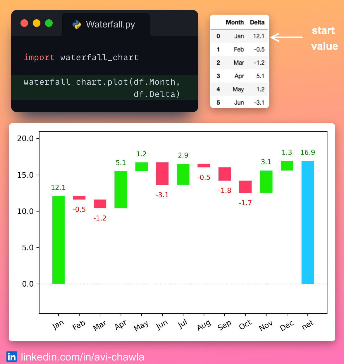
Instead, you can use a waterfall chart, which elegantly depicts these rolling differences.
To create one, you can use 𝘄𝗮𝘁𝗲𝗿𝗳𝗮𝗹𝗹_𝗰𝗵𝗮𝗿𝘁 in Python. Here, the start and final values are represented by the first and last bars. Also, the marginal changes are automatically color-coded, making them easier to interpret.
Read more here: GitHub.
Read this post on LinkedIn: Post Link.
I like to explore, experiment and write about data science concepts and tools. You can read my articles on Medium. Also, you can connect with me on LinkedIn.


