Waterfall Charts: A Better Alternative to Line/Bar Plot
Another hidden gem for data visualization.
To visualize the change in value over time, a line (or bar) plot may not always be an apt choice.
A line-plot (or bar-plot) depicts the actual values in the chart. Thus, at times, it can be difficult to visually estimate the scale of incremental changes.
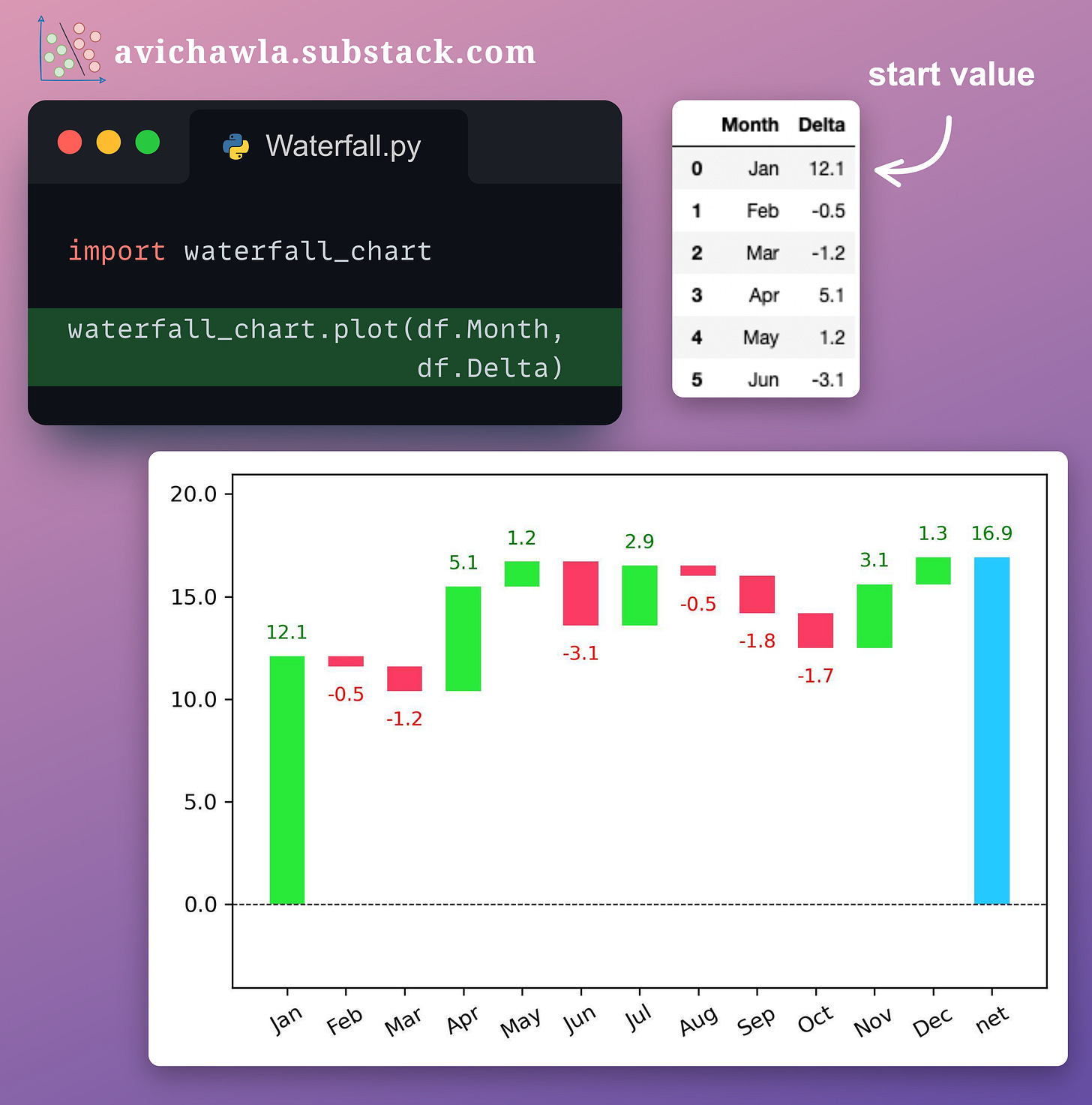
Instead, create a waterfall chart. It elegantly depicts these rolling differences.
Here, the start and final values are represented by the first and last bars. Also, the marginal changes are automatically color-coded, making them easier to interpret.
Over to you: What are some other cases where Bar/Line plots aren’t an ideal choice?
Read more here: GitHub.
👉 Read what others are saying about this post on LinkedIn and Twitter.
👉 Tell me what makes this newsletter special for you by leaving a review here. It would mean the world to me :)
👉 If you liked this post, don’t forget to leave a like ❤️. It helps more people discover this newsletter on Substack and tells me that you appreciate reading these daily insights. The button is located towards the bottom of this email.
👉 If you love reading this newsletter, feel free to share it with friends!
Find the code for my tips here: GitHub.
I like to explore, experiment and write about data science concepts and tools. You can read my articles on Medium. Also, you can connect with me on LinkedIn and Twitter.


