Sankey Diagrams: An Underrated Gem of Data Visualisation
A pretty useful plot which simplifies visualizing flow data.
Many tabular data analysis tasks can be interpreted as a flow between several source and target entities.
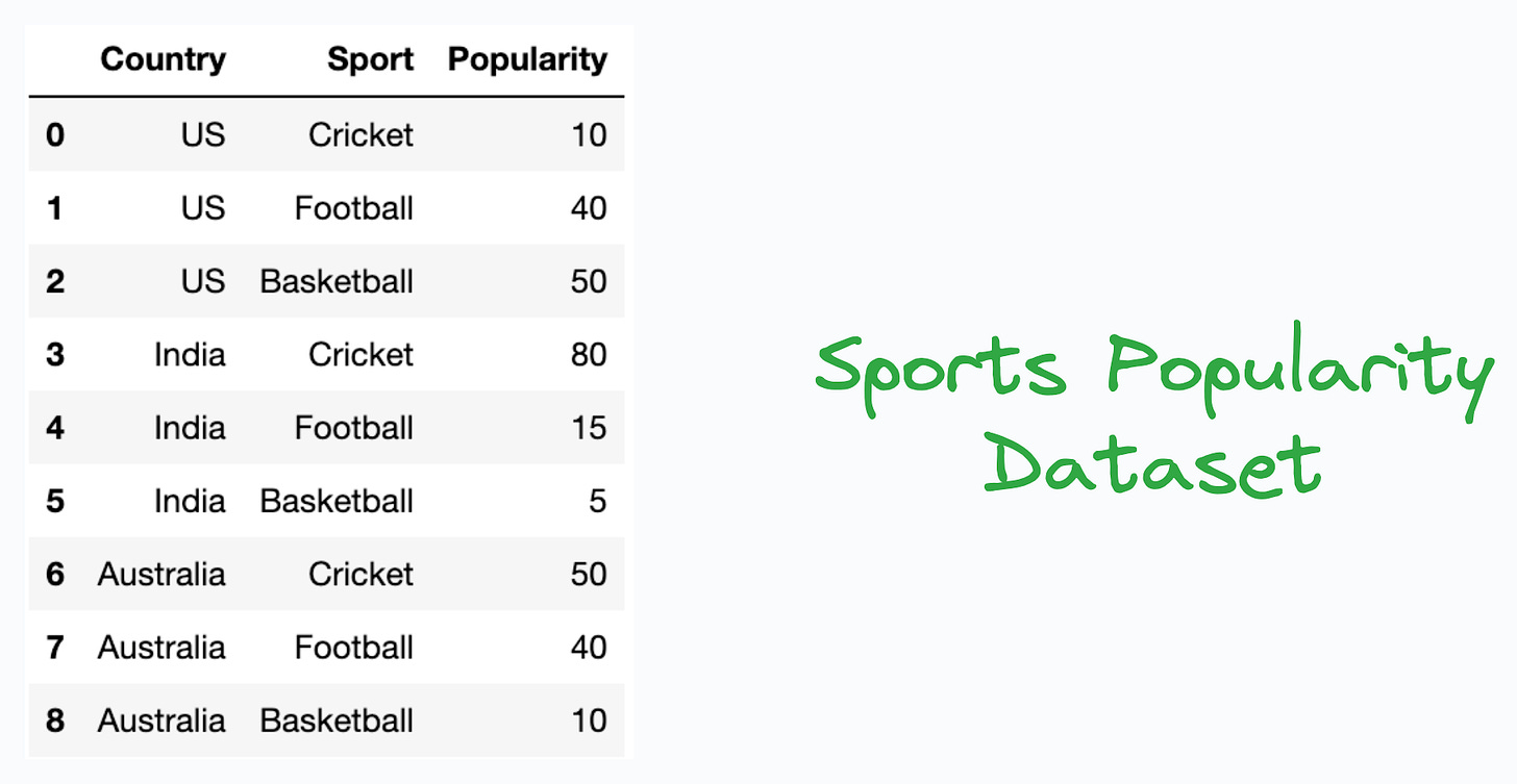
For instance, consider we have a sports popularity dataset, which lists the popularity index of a sport in a country, as shown below:
In this dataset:
Countries are entities.
Sports are entities.
Information flowing between them is the popularity value.
While typical plots, like grouped bar plots, could be used here to understand the popularity distribution of country-wise sports, as shown below:
…in my opinion, however, Sankey diagrams stand out as a pretty cool and elegant alternative to represent such flow datasets:
Their links are represented with arcs whose width is proportional to the value of the flow. This immensely simplifies the data analysis process.
For instance, from the Sankey diagram above, one can quickly infer that:
The most popular sport in India is Cricket.
Basketball and Football are almost equally popular in the US.
Basketball is hardly popular in India and England.
England’s most popular sport is Football.
Cricket and Football are almost equally popular in Australia.
Overall, Football is the most popular sport in this dataset.
and many many more.
Imagine doing that by looking at the tabular data or a grouped bar chart.
This process will be time-consuming.
You may miss out on a few insights.
The grouped bar chart can appear pretty cluttered and messy at times.
Of course, Sankey diagrams can have multiple levels as well, as shown below:
To determine when to use Sankey diagrams, see if the data involves any kind of flow of resources, energy, or information flow between multiple stages or entities.
If yes, Sankey diagrams could be pretty valuable.
There are multiple ways to create Sankey diagrams:
To generate them programmatically, you may use the
ipysankeywidgetlibrary: GitHub.If you prefer GUI, SankeyMATIC is a pretty cool, and easy-to-use tool to create Sankey diagrams which I often use: SankeyMATIC.
Aren’t these Sankey plots quite an elegant plotting alternative to traditional plots that you may have used otherwise?
👉 Over to you: What are some other gems of data visualization that deserve more attention?
👉 If you liked this post, don’t forget to leave a like ❤️. It helps more people discover this newsletter on Substack and tells me that you appreciate reading these daily insights.
The button is located towards the bottom of this email.
Thanks for reading!
Latest full articles
If you’re not a full subscriber, here’s what you missed last month:
DBSCAN++: The Faster and Scalable Alternative to DBSCAN Clustering
Federated Learning: A Critical Step Towards Privacy-Preserving Machine Learning
You Cannot Build Large Data Projects Until You Learn Data Version Control!
Sklearn Models are Not Deployment Friendly! Supercharge Them With Tensor Computations.
Deploy, Version Control, and Manage ML Models Right From Your Jupyter Notebook with Modelbit
Gaussian Mixture Models (GMMs): The Flexible Twin of KMeans.
To receive all full articles and support the Daily Dose of Data Science, consider subscribing:
👉 Tell the world what makes this newsletter special for you by leaving a review here :)
👉 If you love reading this newsletter, feel free to share it with friends!


Incrível explicação, meu modo de visualizar e extrair insights mudou completamente, muito obrigada!!
Nice blogs in data visulalisation