Sparklines: Create Plots in A DataFrame’s Cell
A concise and elegant way to create visualisations.
When doing any data analysis task in Jupyter, we mostly create standalone charts and visualizations.
Of course, there’s nothing wrong, but today, let me introduce you to another pretty cool and elegant way I often use to create visualizations in Jupyter Notebook.
Background:
Whenever we display a DataFrame in Jupyter, it is rendered using HTML and CSS.
This means we can format its output just like any other web page.
Moreover, when we create any plot in Jupyter, it is rendered as an image.
However, the same image can also be rendered within an HTML image tag in Jupyter.
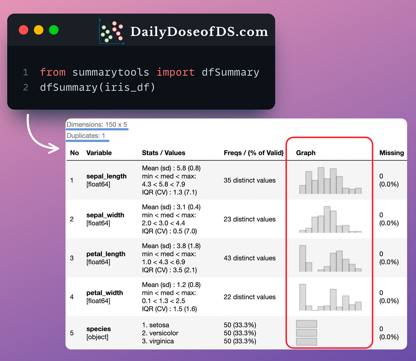
And magic happens when we combine the above two ideas — rendering plots inside a DataFrame, as depicted below:
Formally, these compact plots are called Sparklines, and they provide a pretty elegant way to visualize data without taking up too much space.
Unlike traditional plots, we typically do not create axis ticks and labels in Sparklines.
One of the coolest ways I prefer using Sparklines is by adding them to a DataFrame’s cell, as depicted in the image above.
In fact, if you remember the newsletter issue in which we discussed SummaryTools, this is precisely how the SummaryTools library creates the “Graph” column:
Pretty cool, isn’t it?
You can download my Jupyter Notebook to learn how to create Sparkline plots: Sparkline Plot Notebook.
In this notebook, I have provided the step-by-step procedure to embed Sparklines in a DataFrame.
👉 Over to you: What are some other cool and lesser-known ways to create data visualizations?
1 Referral: Unlock 450+ practice questions on NumPy, Pandas, and SQL.
2 Referrals: Get access to advanced Python OOP deep dive.
3 Referrals: Get access to the PySpark deep dive for big-data mastery.
Get your unique referral link:
Are you overwhelmed with the amount of information in ML/DS?
Every week, I publish no-fluff deep dives on topics that truly matter to your skills for ML/DS roles.
For instance:
A Beginner-friendly Introduction to Kolmogorov Arnold Networks (KANs).
5 Must-Know Ways to Test ML Models in Production (Implementation Included).
Understanding LoRA-derived Techniques for Optimal LLM Fine-tuning
8 Fatal (Yet Non-obvious) Pitfalls and Cautionary Measures in Data Science
Implementing Parallelized CUDA Programs From Scratch Using CUDA Programming
You Are Probably Building Inconsistent Classification Models Without Even Realizing.
And many many more.
Join below to unlock all full articles:
SPONSOR US
Get your product in front of 80,000 data scientists and other tech professionals.
Our newsletter puts your products and services directly in front of an audience that matters — thousands of leaders, senior data scientists, machine learning engineers, data analysts, etc., who have influence over significant tech decisions and big purchases.
To ensure your product reaches this influential audience, reserve your space here or reply to this email to ensure your product reaches this influential audience.


