Visualize Skewed Geographical Data
A lesser-known technique to counter skewness.
Skewness can potentially distort everything you do with data:
data analysis,
data visualization, and
modeling.
I recently wanted to visualize skewed geographical data, but visualization didn’t make any sense.
While I cannot share the data and the visualization because it is private, let me walk you through an inspiring example I found which helped me handle this problem.
But first, some context!
Log transform is commonly used to eliminate skewness in data.
For instance, applying a log transform to a right-skewed distribution creates a somewhat normal distribution.
There are some considerations though, which we covered here in this newsletter: A Misconception About Log Transform.
That said, we can leverage the same idea of log transform while visualizing data. I came across it in this blog by Databrewer: Methods to Visualize Data with Skewed Distribution.
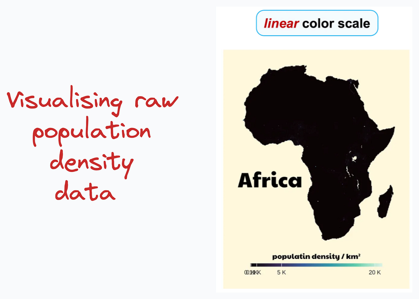
To exemplify, consider we want to visualize the population density in Africa. With raw data, we hardly get to notice any insights here, as depicted below:
The reason is pretty obvious — the data is heavily skewed, as also visible in the color scale in the above plot.
Now consider visualizing log-transformed data, which is depicted below:
For instance, consider Egypt (top right side of Africa):
Most of the area is greyed because the population density here is zero.
You can also notice the Nile River in Egpyt, around which there’s a heavily dense region.
This time, it’s super clear, isn’t it?
Note that the color scale has changed in the new plot since we are visualizing log-transformed data.
I used the same method in my use case, resulting in much better visualization.
Here, I would highly recommend reading the blog by Databrewer: Methods to Visualize Data with Skewed Distribution.
While I covered only geographical data in this issue, the above blog covers more data types.
👉 Over to you: What techniques do you use to visualize skewed data?
1 Referral: Unlock 450+ practice questions on NumPy, Pandas, and SQL.
2 Referrals: Get access to advanced Python OOP deep dive.
3 Referrals: Get access to the PySpark deep dive for big-data mastery.
Get your unique referral link:
Are you overwhelmed with the amount of information in ML/DS?
Every week, I publish no-fluff deep dives on topics that truly matter to your skills for ML/DS roles.
For instance:
A Beginner-friendly Introduction to Kolmogorov Arnold Networks (KANs)
5 Must-Know Ways to Test ML Models in Production (Implementation Included)
Understanding LoRA-derived Techniques for Optimal LLM Fine-tuning
8 Fatal (Yet Non-obvious) Pitfalls and Cautionary Measures in Data Science
Implementing Parallelized CUDA Programs From Scratch Using CUDA Programming
You Are Probably Building Inconsistent Classification Models Without Even Realizing
And many many more.
Join below to unlock all full articles:
SPONSOR US
Get your product in front of 82,000 data scientists and other tech professionals.
Our newsletter puts your products and services directly in front of an audience that matters — thousands of leaders, senior data scientists, machine learning engineers, data analysts, etc., who have influence over significant tech decisions and big purchases.
To ensure your product reaches this influential audience, reserve your space here or reply to this email to ensure your product reaches this influential audience.


Thank you for sharing the article for diving deeper.